Challenge
Edelstein is a Boston-based CPA firm that serves individuals as well as private and publicly-held companies.
When we first met the Edelstein team, it was obvious they are not your typical CPA firm. But their current website and marketing materials were bland and generic at best. The firm needed a new, vibrant brand reflective of their unique way of working. We began by conducting a thorough brand analysis.
Our initial challenge was to:
- Identify the core components that make Edelstein unique
- Understand why clients choose Edelstein and stay with the firm
- Assess direct competition to determine how to differentiate Edelstein’s value to clients
- Define the firm’s brand pillars
We interviewed members of the firm as well as long-time and newly-acquired clients. Additionally, we conducted a review of competitors’ visual branding, messaging, and online marketing.
Once the research was complete, we presented a formal Findings Report to Edelstein’s marketing committee, along with recommendations for the new brand position and messaging. The Findings Report distilled all of the data collected during the audit into a multi-page document that the firm can use as a reference for all future marketing initiatives. These findings, especially clients’ descriptions of the firm, were critical to formulating the message and design of the new brand.
Solution
Our findings pointed to a style of work that was evident when we first met the Edelstein team — they truly enjoy what they do, and their clients enjoy working with them. In fact, the word “fun” came up many times. Clockwork repositioned the firm’s brand to emphasize and align with their true personality. Now, the style of the firm really comes through and the consistent implementation across all marketing media is what drives this brand home.
How We Did It:
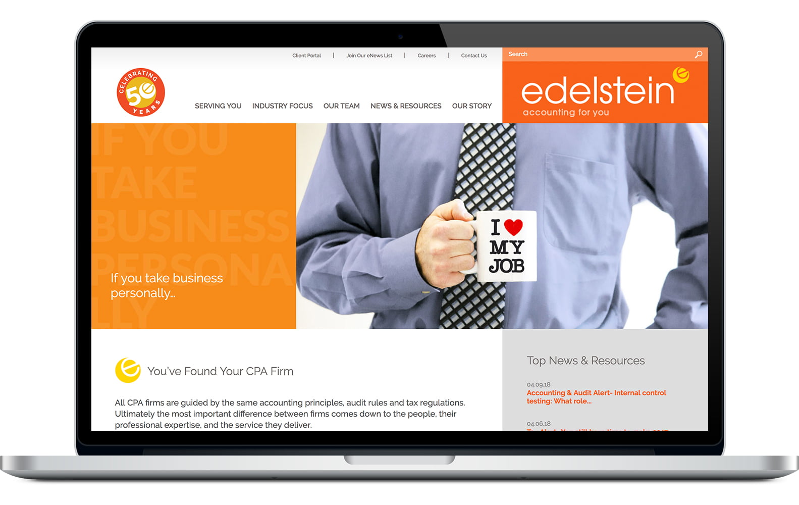
- Modernized the logo and added a lively, lighthearted, tilted “e” icon as well as a client-focused tagline, “accounting for you.”
- Crafted client-focused messaging for the homepage and interior pages of the site.
- Designed and built a fully-responsive WordPress website.
- Shot custom photos for the homepage animation with actual employees at the firm. Each bio portrait was taken on location, with a relaxed and friendly pose.
- Designed an extensive set of collateral items, including multiple pocket folders, letterhead, business cards, note cards, notepads, print ads and more.
- Designed several items for on-screen use, including email and PowerPoint templates.
- Helped to kick off the launch of the new brand by creating an animated announcement.
Before & After
Drag the below divider right for “before” and left for “after”


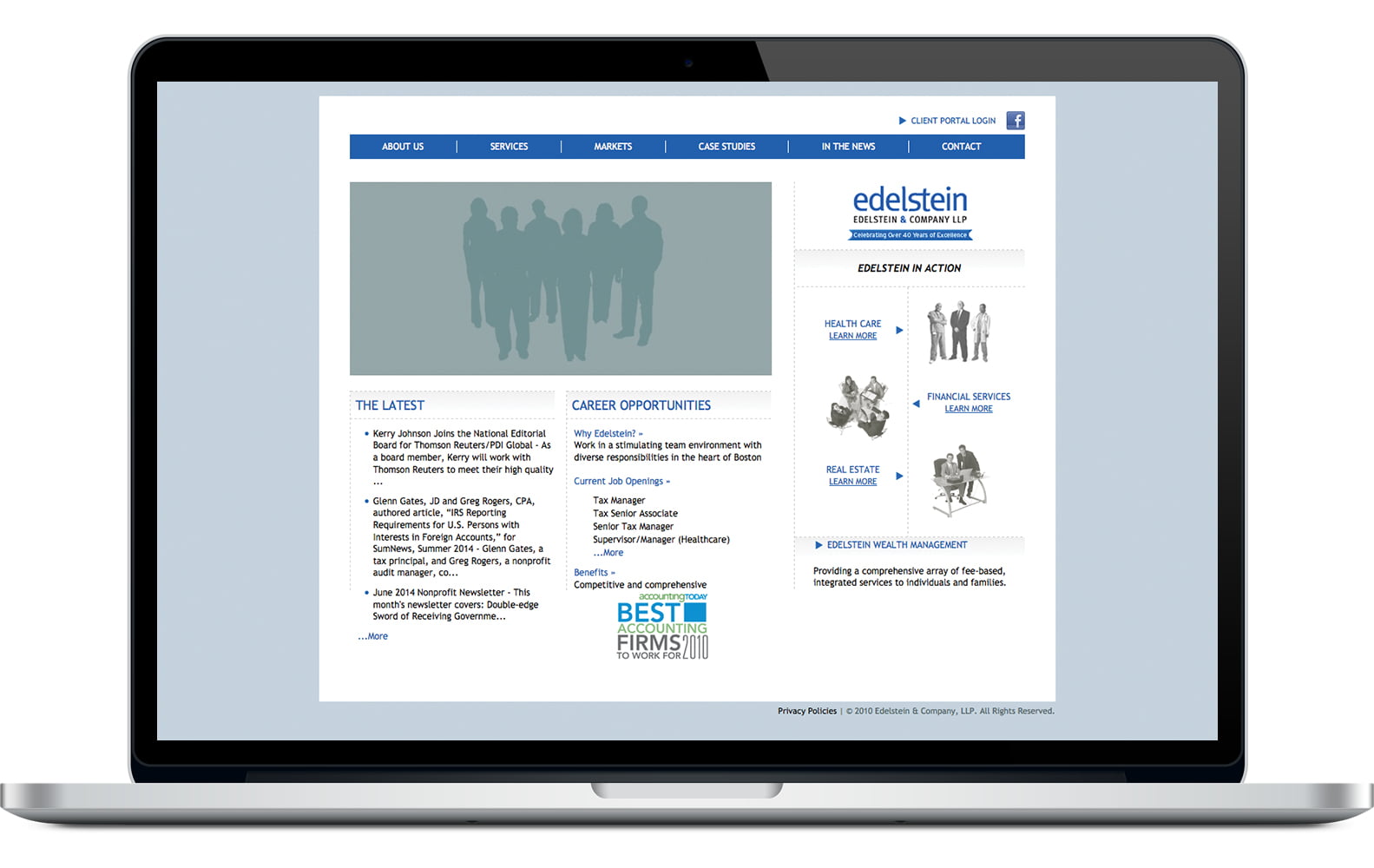
The previous site lacked focus, personality, and anything that separated the firm from other CPA firms.
The new site and accompanying marketing materials explode with energy, warmth, friendliness, and “fun.”
Results
The rebranding has been effective in many ways:
- Clients have found the site much more engaging and intuitive to use.
- There was an immediate increase in traffic to the site and a high ratio of pageviews.
- The launch was very successful, with members of the firm receiving overwhelmingly positive responses from existing and prospective clients.
- The rebranding brought employees and management together in a unique and cohesive way. By involving many people at the firm in the process, listening closely during interviews and incorporating everyone’s input, we ensured there is a true sense of brand ownership.
- Additionally, the branding process reinforced the value everyone at the firm provides to their clients, which reinvigorated their business development efforts.


