Working with the architecture firm DRA (Drummey Rosane Anderson) on their rebranding was an exciting and rewarding project. Congratulations to DRA on their bright new brand!
Logo Design
A new, bold, clean and modern logo was designed and implemented across all marketing materials. The square orange box hangs from the top of web pages and collateral pieces in flag-like fashion.
Website
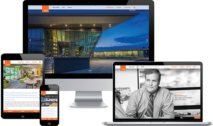
The new DRA website showcases the firm’s work as well as its people and process. The new homepage features striking project images from the four main markets DRA serves: Academic, Civic, Performing Arts, and Athletic. Interspersed with these colorful photos are black and white portraits of team members at work paired with phrases about the firm’s core process: Listen, Learn, Collaborate, Create.
The new website design utilizes many crosslinks that encourage visitors to keep exploring the site. For example:
- Project pages include links to the project leadership, markets, and related projects by market type.
- On the main portfolio pages such as K-12, Performing Arts, etc., clickable photos and names of “Key Contacts” are shown so site visitors immediately know who to reach out to for more information.
- Throughout the site, the latest blog posts and related posts are featured to promote the firm’s thought leadership, news, and events.
- Related News and Related Projects, shown on bio pages, also promote continued site engagement.
Some additional site features include:
- A fully responsive design including intuitive sticky (fixed) navigation on all devices.
- A fluid grid to show project imagery that fills the whole window.
- Portfolio sort by market type by two-tiers, which helps position the firm more broadly across their main markets (i.e. Academic) as well as showcase their more specific specialties (i.e. K-12 Public).
- Fun, color portraits on rollover on the People landing page.
- A photo film strip on the About and Culture pages that visually share the experience of working with and for DRA.
- In the Firm section of the site, a firm leadership portrait slider (with links to each person’s bio) that helps convey the firm’s friendly and collaborative style.
- A robust, integrated Blog to publish the firm’s thought leadership, news, and events.
- Sitewide search results that are sorted by and filterable by the section of the site.
- A Twitter feed in the footer that pulls the latest tweets from the firm.
- An eNews sign-up that integrates with the firm’s email platform.
Print & Digital Collateral
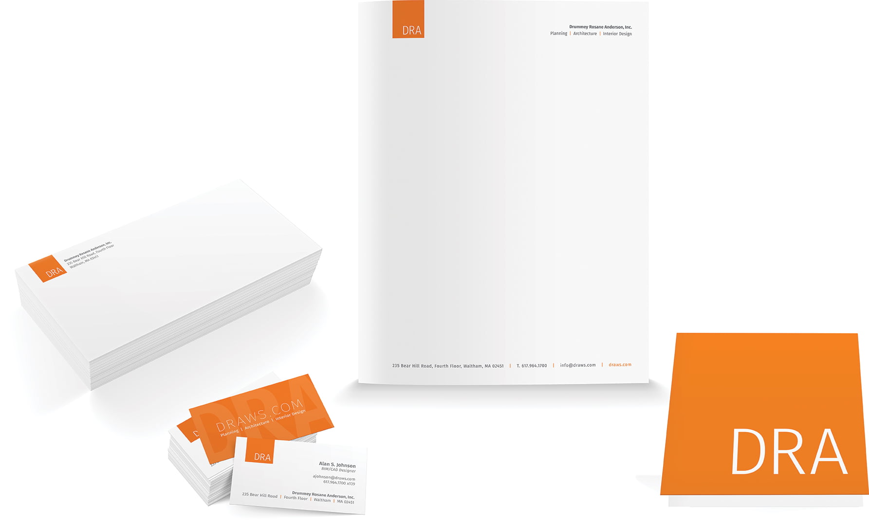
The orange and gray color palette carries through all marketing materials including pocket folders, stationery, note cards, and more.


