Congratulations to Zalkind Duncan & Bernstein on their exciting new brand! The new logo, strong color palette, typographic design, black and white portraits, and powerful messaging come together to create a brand and website that is visually striking and memorable.
Zalkind Duncan & Bernstein enlisted Clockwork to update their brand to accurately position their firm, convey the experience of working with them, appeal to current clients, prospects, as well as referring lawyers. First, we conducted a brand analysis that included internal and external interviews, competitor reviews, and a branding SWOT analysis (strengths, weaknesses, opportunities, and threats). Based on that research, we determined the firm’s brand pillars, which support the new brand that we developed, including:
Logo
The logo is modern and crisp with a knocked out “Z” that can be used as a standalone logo element for social media.
Website
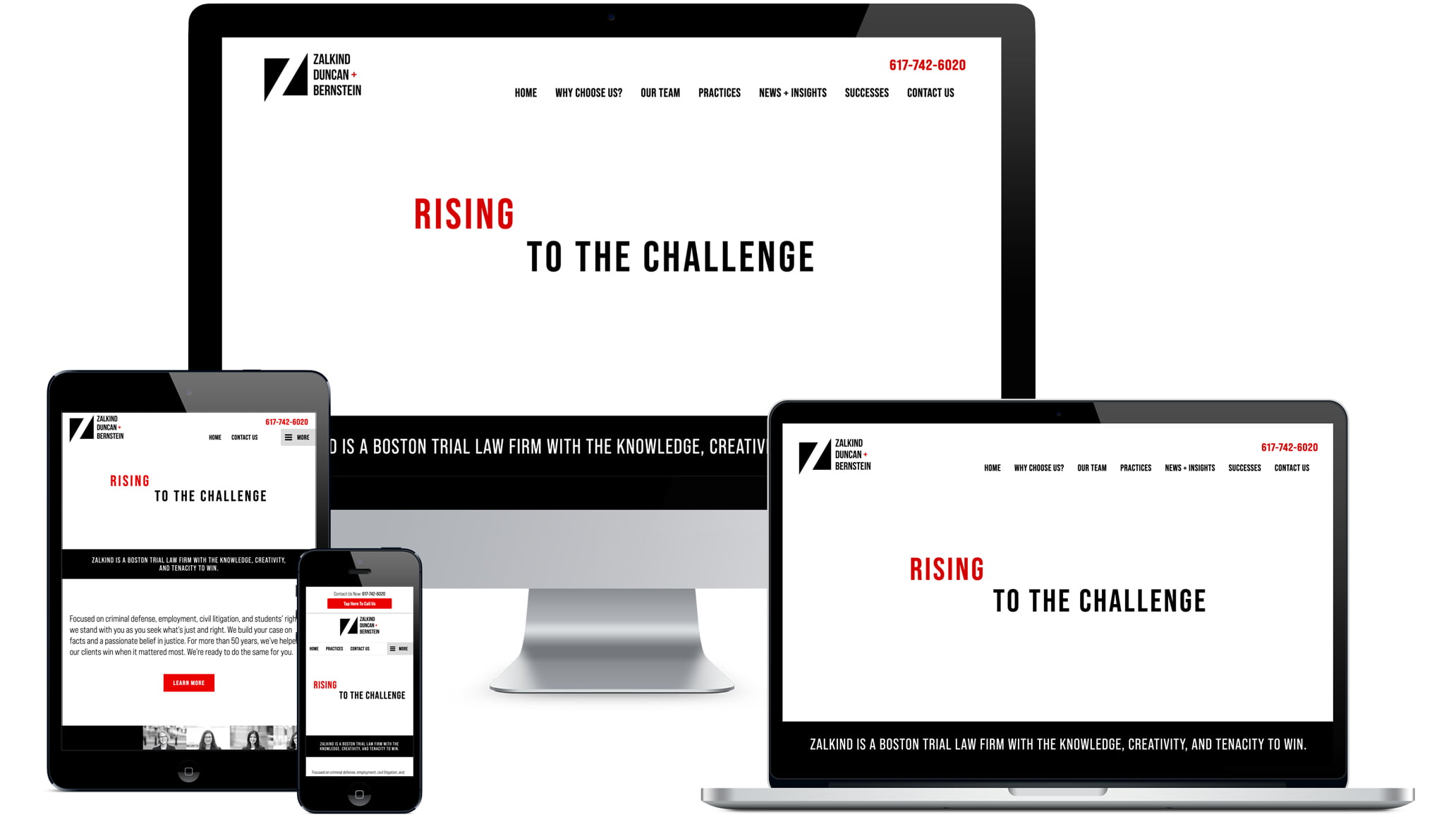
Working with Zalkind’s existing website platform, Justia, we created a drastically more modern look while maintaining the existing website framework. The homepage accentuates the messaging “Rising to the challenge” by animating the word “Rising,” drawing in site visitors to keep them reading and exploring. Clockwork crafted all the messaging on the homepage, as well as select pages throughout the site, to speak directly to clients and prospects. Additionally, we coordinated and art directed the portraits and “at work” editorial-style banner shots, photographed by David Shopper.
Collateral
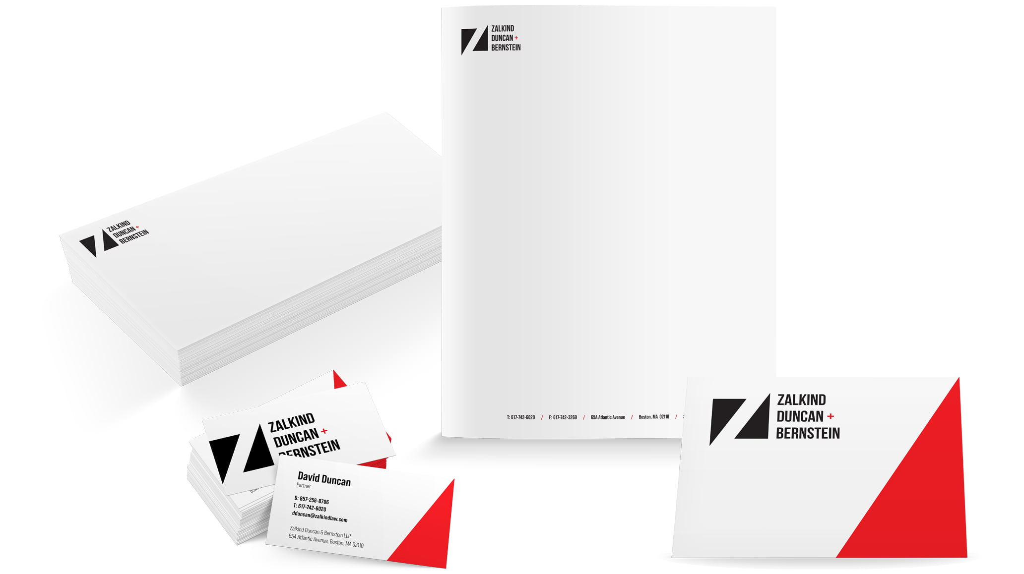
Once the brand direction and logo were approved, we created the coordinating stationery and social media banner designs.

