Want clearer insights from your Google Analytics data? Looker Studio simplifies the process by helping you create clear, visual reports that transform how you view your data. This guide will show you how to easily organize your Google Analytics data into compelling infographics that both you and your less data-savvy colleagues will appreciate.
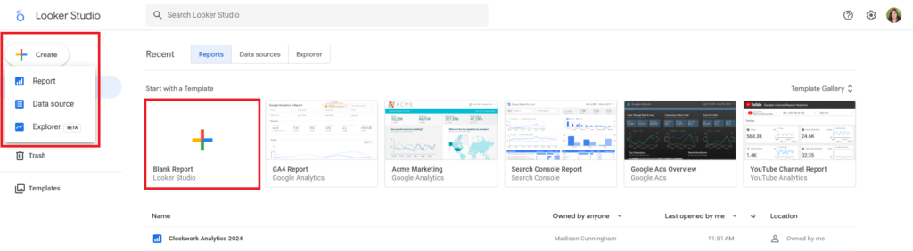
1. Create a New Report in Looker Studio
Start by heading to Looker Studio and creating a new report. (Note: If you’re planning on keeping your report general, you can save time by using one of Looker Studio’s pre-made templates. These templates are already structured; you just need to swap in your data source.)
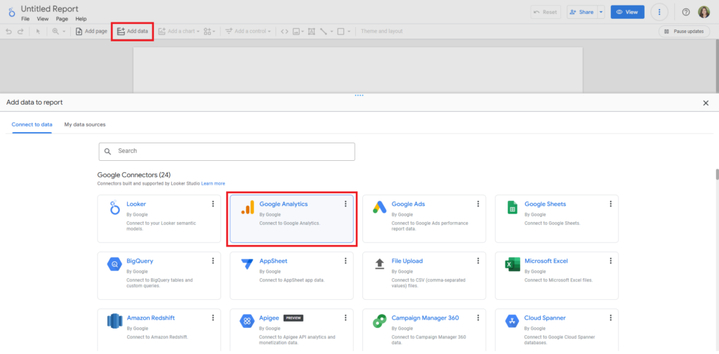
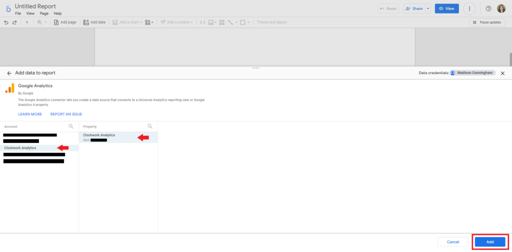
2. Connect Your Google Analytics Data
For this tutorial, we’ll use Google Analytics as our data source. But feel free to link other sources, like Google Ads or Search Console, depending on your needs. Simply select your account and preferred sub-property. If you’d like to include additional data sources, you can easily add them once the report is created by clicking the “Add Data” button.
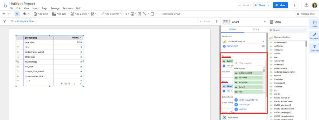
3. Choose Your Dimensions and Metrics
Looker Studio will begin with a simple table displaying Events and Views. Click the table to open the Setup panel. To modify a dimension or metric, click on the assigned one. Alternatively, click the plus sign below to add a new one. A smaller search box will appear, allowing you to browse all available data groups. You can then mix and match the most relevant dimensions and metrics to analyze your website’s performance.
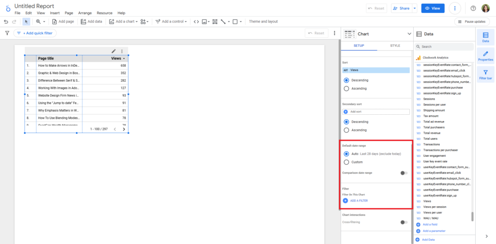
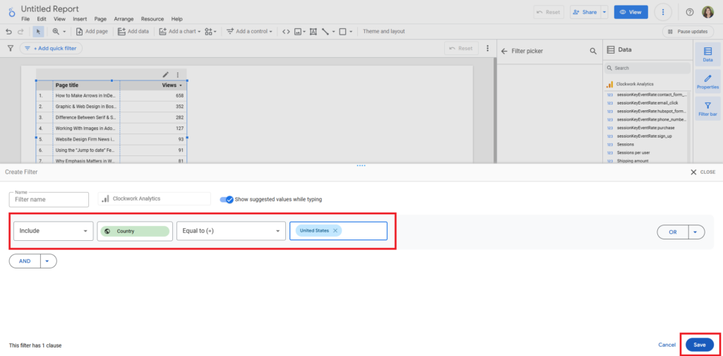
4. Add Filters
Want to narrow down your data? Scroll to the bottom of the setup panel to edit the date range or add a filter. Filters allow you to focus on specific timeframes, traffic sources, or even exclude bot traffic. This step helps you get more meaningful insights without the noise.
Tip: If you have a filter you want to apply universally to the report, go to File > Report Settings to open a panel where you may assign default date ranges and filters.
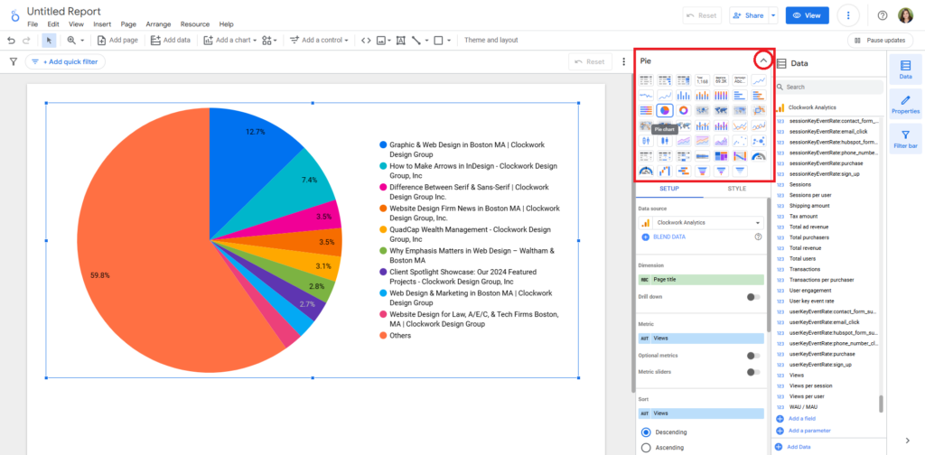
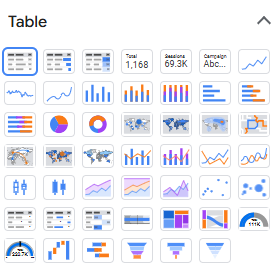
5. Customize Charts to Visualize Your Data
Every chart in Looker Studio is fully customizable, not only in terms of the metrics it displays but also in how it looks. Above the setup panel, you’ll find a drop-down labeled “Charts” full of various styles. Select one to automatically change the view of your report. Experiment with different chart types (bar, line, pie, etc.) to find the best way to present your data.
6. Repeat and Expand
Don’t stop at just one chart—keep building! Add more charts with different dimensions, metrics, or filters that give you a fuller picture of your website’s performance.
Tip: If you run out of room, go to Page > New Page to add a new one.
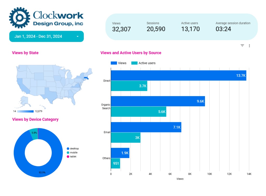
We’ve included a chart of our favorite report customizations below to help you get started:
| Report | Chart Style | Dimension | Metric | Filter |
|---|---|---|---|---|
| Total Views by State | Geo Chart | Region | Views | Country: Include = US |
| Total Views by Device Category | Donut Chart | Device Category | Views | Country: Include = US |
| Total Views and Active User by Source | Bar Chart | Source | Views Active Users | |
| Top Pages Visited | Table with Bars | Page Title Full page URL | Views | |
| Referral Sources | Table with Bars | Source | Views | Medium: Include = referral |
| Social Media Landing Pages | Table with Bars | Landing Page | Views | Medium: Include = organic social |
What’s Next?
Remember to name your report! If you’re familiar with Google Workspace, Looker Studio works similarly. Just click on the default “Untitled Report” in the upper left corner to add your title. And no need to worry about saving—your work is automatically saved to the cloud after every edit. You can also share, view, or download the report just like a Google Doc or Sheet using the options in the top bar.
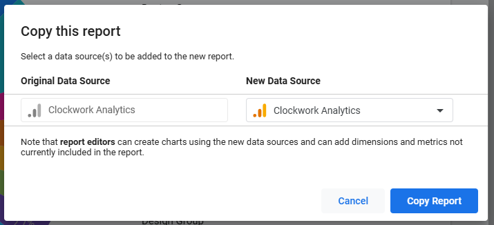
Ready for the best part? Now that your Looker Studio report is set up you can easily copy reports and edit them to track your data over time — making monthly or quarterly reporting a breeze!
About The Author