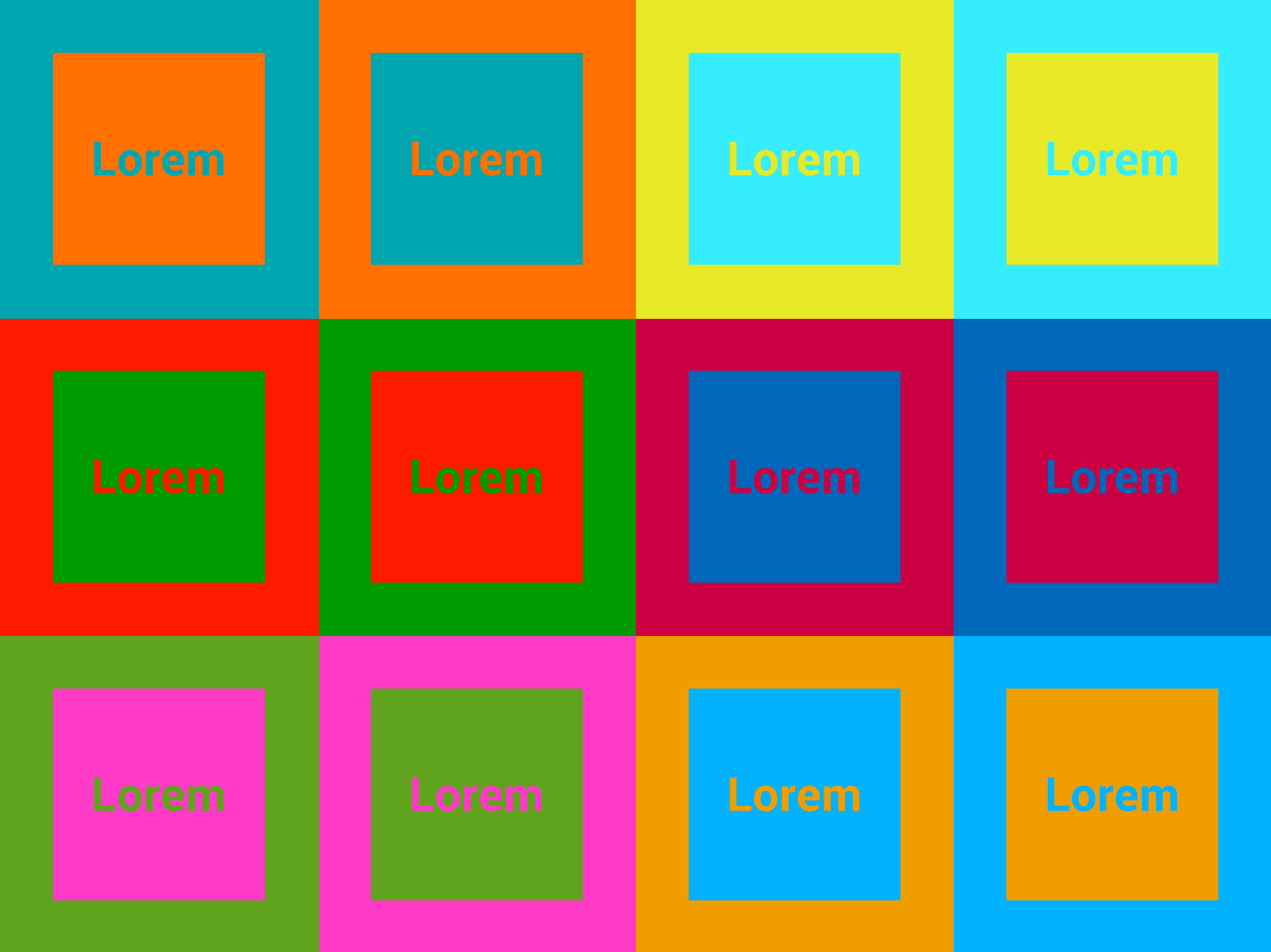
When navigating the physical world, color is a natural cue that we use to understand the space around us. In today’s digital world we use color for the same thing. Occasionally, our minds will get hijacked by certain color combinations that just don’t play nicely together. These vibrating color combinations can be jarring, aggressive, and disconcerting. It’s especially important to avoid these color combinations in web design since legibility is critical for both navigation and comprehension.
It’s an exciting time to be a web designer. With modern typography, robust design tools, and technological advances, web designers have more options than ever before to design engaging user experiences. With that said, it can be tempting to mimic some of the vibrant color schemes found in print design. It is important to note the distinctions between print and web design. In print, vibrating color is more permissible, even an advantage to making your designs stand out amongst the crowd. In web design, it’s a bit more finicky.
What on earth is chromostereopsis and why should you avoid it?
Chromostereopsis is a visual illusion where the impression of depth is conveyed in two-dimensional color images, usually of red-blue or red-green colors. These types of color combinations appear to vibrate when placed next to each other. This is especially problematic in digital environments. Some colors naturally appear to recede in space, while others seem to float forward. When certain colors are placed directly next to each other and are of the same spatial hue they appear to be moving or vibrating. All colors have a spatial relationship with each other.
What NOT to do:

What About Accessibility?
When color vibration occurs, the element most strongly affected by the glowing distortion effect is the edge between the two colors. This is why vibration is particularly dangerous in the context of UI fonts, small icons, and other detailed elements which are not large enough to compensate for their blurry vibrating edges.
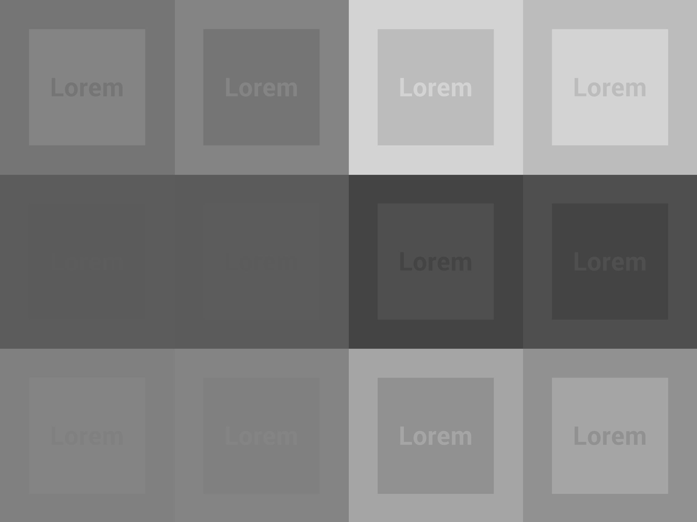
Not only are vibrating colors jarring to look at for the average person, but they can also severely impede a colorblind person from using the design. See the example below. The first image is specially selected colors that vibrate. Use the slider to the right to display what the same colors would look like to a colorblind user. In order for our website to be accessible by all we really need to be careful about the colors we select. To learn more about ADA Compliance in Web Design take a look at our article “Is Your Website ADA Compliant?”.


Key Takeaway
In web design, avoid using vibrating color patterns, especially in navigation and call-to-action buttons. Your visitors will thank you!
––––
ADDITIONAL RESOURCES:
Why Certain Color Combinations Drive Your Eyeballs Crazy
Why You Should Avoid Vibrating Color Combinations
Complementary Colors
Basic Color Theory
Canva’s Everything You Need to Know About Colors


