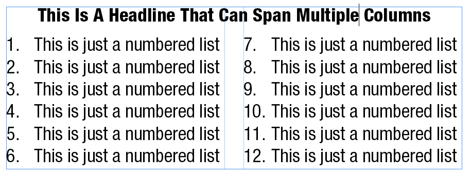
Here’s a quick technical tip InDesign users can try to keep text that’s supposed to be together… well… together. It’s particularly useful when it comes to titles or headlines.
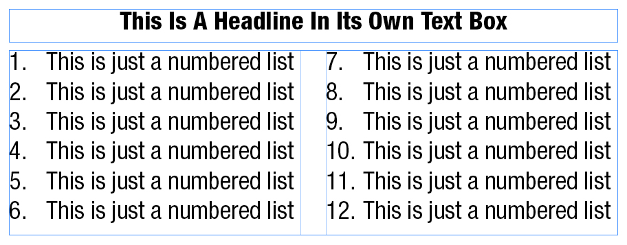
Back in the olden days, if you had a headline you wanted to span multiple columns of text, you had to set it in its own text box:
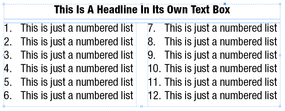
If you really wanted to play it safe and make sure those two text boxes stayed together, you might even use the Group command (note the dashed line around the boxes:
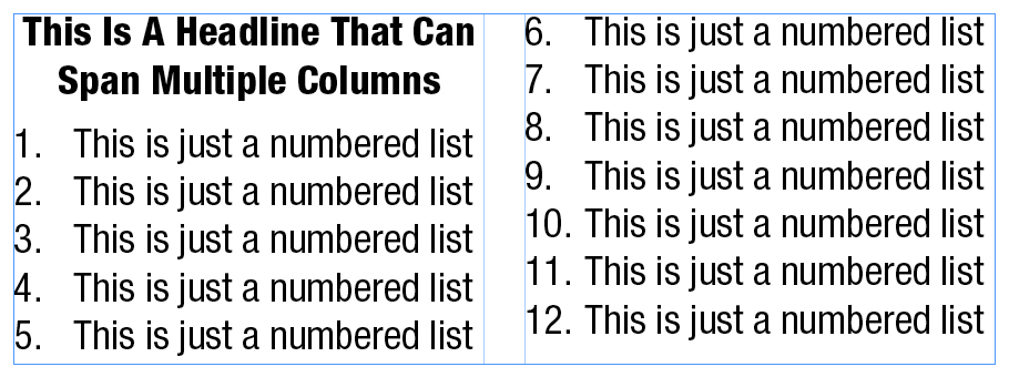
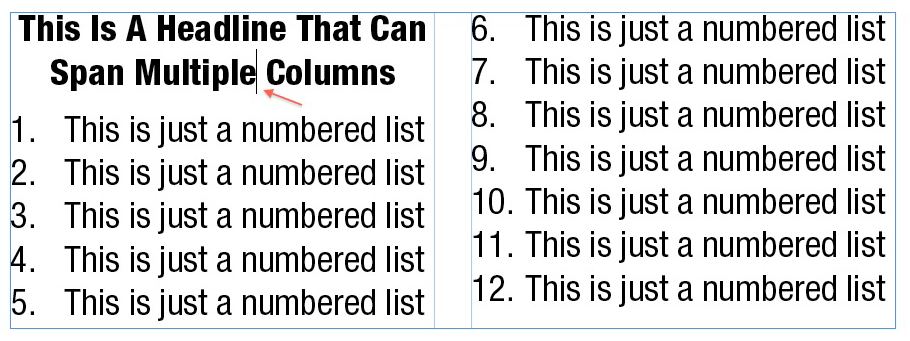
Nowadays, there’s a much simpler and cleaner way of achieving the same result without all the possible problems of managing more than one text box. Just put the headline right into the single text box, at the beginning of the text:
Next, drop your cursor anywhere in the headline text:
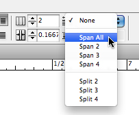
Depending on how your InDesign interface is set up, look for these controls (probably in the upper-right of your screen, just after the control for the number of columns you want in your text box – in this case, two):

Grab the drop-down menu that currently says “None” and change it to “Span All”:
And voilà, you’ve now got a column-spanning headline that’s part of the single text box:
