Maps can be a powerful visual representation to support your strategic, geographic positioning as a firm. Before diving into creating a map, it is vital to consider your goals and what you want to convey. Below are several examples that showcase a variety of solutions and why they work.
Office pins & labels
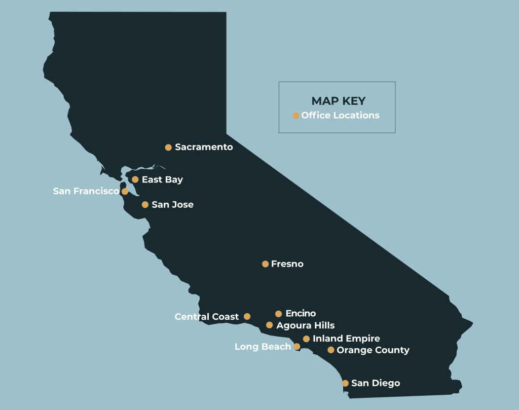
Albert & Mackenzie’s Offices landing page features this map paired with the text “California Covered.” As a workers’ compensation defense firm, their presence near Workers’ Compensation Appeals Board (WCAB) venues in California is very important to current and prospective clients. Since they are geographically concentrated in CA, it is possible to show all their locations with dots and location labels.
Office pins only
Hassett Donnelly’s homepage showcases the regional map with location pins paired with the text “Delivering Results Throughout the Northeast.” This map is effective in showing this litigation firm’s Northeast footprint. The offices are recognizable in city locations so labels are not needed and it helps focus viewers on the top-level regional message. The offices also appear below the map header graphic with links to the individual location pages.
Office pins and state registration map
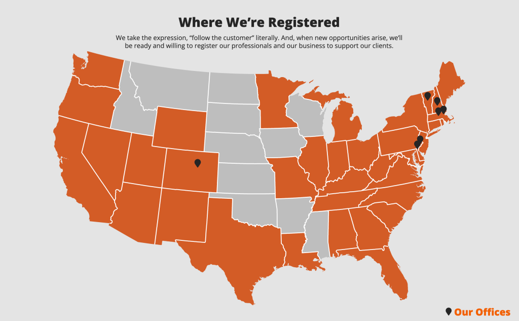
What if your offices do not show the breadth of your true geographic reach? Office location pins alone would not be enough. This map appears on Sanborn Head’s Our Firm page. This is a good example of representing both their physical office location and their broader reach based on where their professionals are registered.
Where We Work Maps
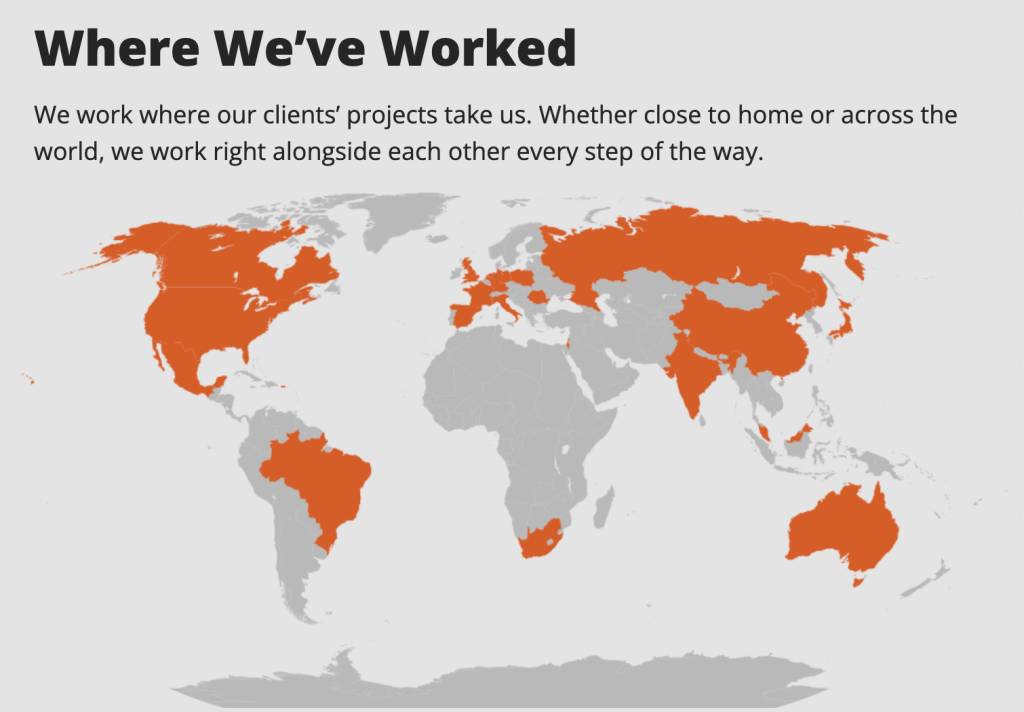
Sanborn Head’s homepage also includes a Where We’ve Worked world map. The firm is emphasizing their global experience and that they are happy to go anywhere. Note that their US offices pin would not work on this map, nor are they crucial in this context.
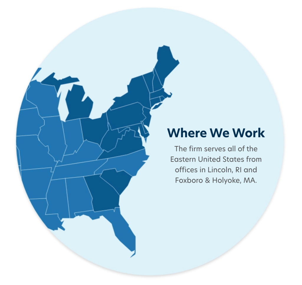
Pare Corporation’s homepage features a map focused entirely on where they work. The subhead description re-enforces the firm’s geographic range and mentioned the office locations as a secondary component. If you only knew their office locations, it would be an incomplete picture of the firm.
Map as an accent only
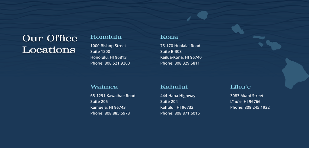
Cades Schutte is Hawai‘i’s largest law firm. The Office Locations page subtly supports and showcases their presence on multiple islands using a map as a visual accent element.
Stats Only
A map might not be the best solution. If your firm is both geographically cluttered and spread out, it might show gaps in your presence that don’t align with your messaging and it might be impossible to label the cluttered locations. When it is hard to visually represent your locations and where you work, it can be more effective to show stats. Stats can also share other important firm facts in a way that is easy to scan and process.
Best Best & Krieger is an esteemed and growing national law firm with offices across the West Coast, Pacific Northwest and in Washington, D.C.
Albert & Mackenzie uses the homepage stats to spotlight their size in both attorney headcount and locations, as well as their claim speed and client satisfaction.
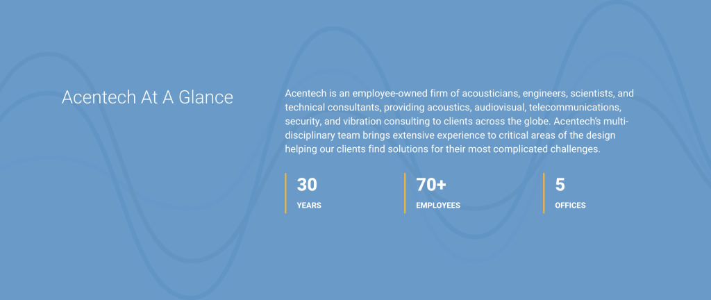
Acentech includes stats on the homepage to help visitors quickly learn more about the firm.
In Conclusion
As we say, an image is worth a thousand words, but it must be the right message. Always consider your strategic positioning before creating a map, stats or an infographic.

