Your inbox is a sacred space. The last thing you want is irrelevant, spam email (unsubscribe anyone?) How can you make sure that your marketing email is hitting the mark and driving your firms’ image forward while staying on-brand? Keep reading for 6 things every email should include to keep your firm consistently branded.
Consistency in branding is imperative. Here’s a quick checklist of branding components every email blast should include. How many are your firm currently utilizing?
1. Include Your Firm Logo
Place your logo at the top of your email template. This will help your email be instantly recognizable in your reader’s inbox.
2. Use Your Brand Colors
Make sure the colors in your email match your brand colors. There are many free tools that help you identify a color’s hex code if you are unsure.
- Chrome Extension: EyeDropper
- Firefox Extension: ColorZilla
- Safari Extension: ColorSlurp
3. Use Consistent Fonts
It’s really important to keep your font choice simple and on-brand. Always maintain the same fonts that you’re using on your website and other marketing materials. This will help your email look clean and consistent. Choose 1-2 fonts max to help readers focus on the message that you are sending.
4. Add Visuals
It’s always a good idea to add relevant imagery that helps tell your story and drives readers to your call-to-action. Use images that visually describe the main point of the article, post, or event you’re promoting. For example, include a portrait for updates about a team member or a stock image that relates to an article topic. Email with images (photos, graphics, illustrations, etc.) are not just nicer to look at, they are drastically more effective in terms of click-through rates. If your firm has a branded style for imagery or other graphics, use it to help build brand recognition through consistency and repetition. Choose images that help people get to know, like, and trust your business.
5. Include Relevant Links and CTAs
Include prominent call-to-action links so people click. If you want readers to learn more about an important update, make it an obvious button. If you want people to register for an event, make sure that call-to-action links directly to the event registration form. Keep it simple and easy for your audience to get where you want them to go.
Additionally, we recommend that you always include a link to your firm’s website homepage. We typically add this to the email template’s footer so it’s consistent on all communications. We also recommend putting links to your social media channels that your firm is most active on. (Note: An “Unsubscribe” option is mandatory for all email marketing and should also appear in the footer. This is usually built into the email template.)
6. Find Your Voice
Bring value to your audience by creating engaging content. Talk through your clients’ pain points, educate them, and guide them to relevant resources. Don’t be afraid to ask them what they’d like to hear more of. Speak in a way that expresses the personality of your firm, share your values, and earn your readers’ trust by providing content that educates and proves your expertise.
Some Inspiration
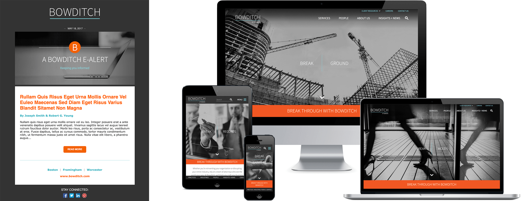
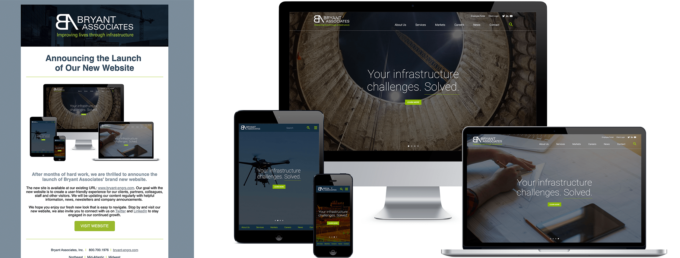
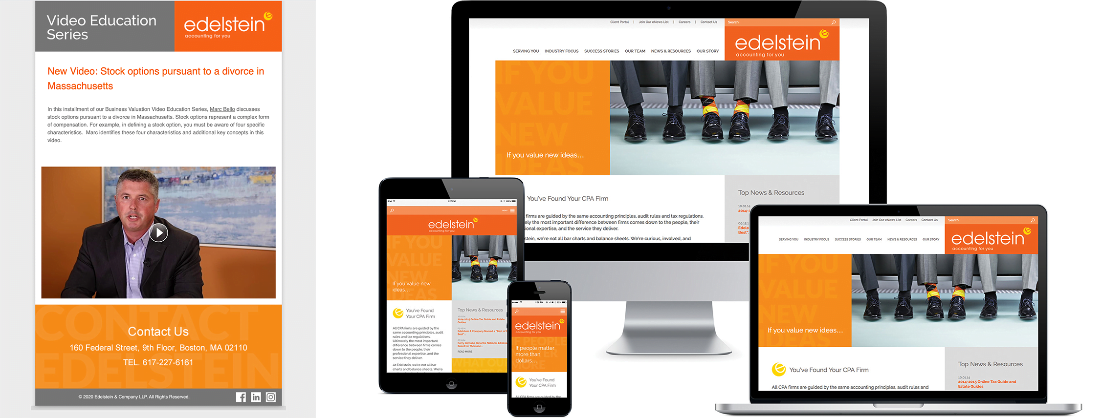
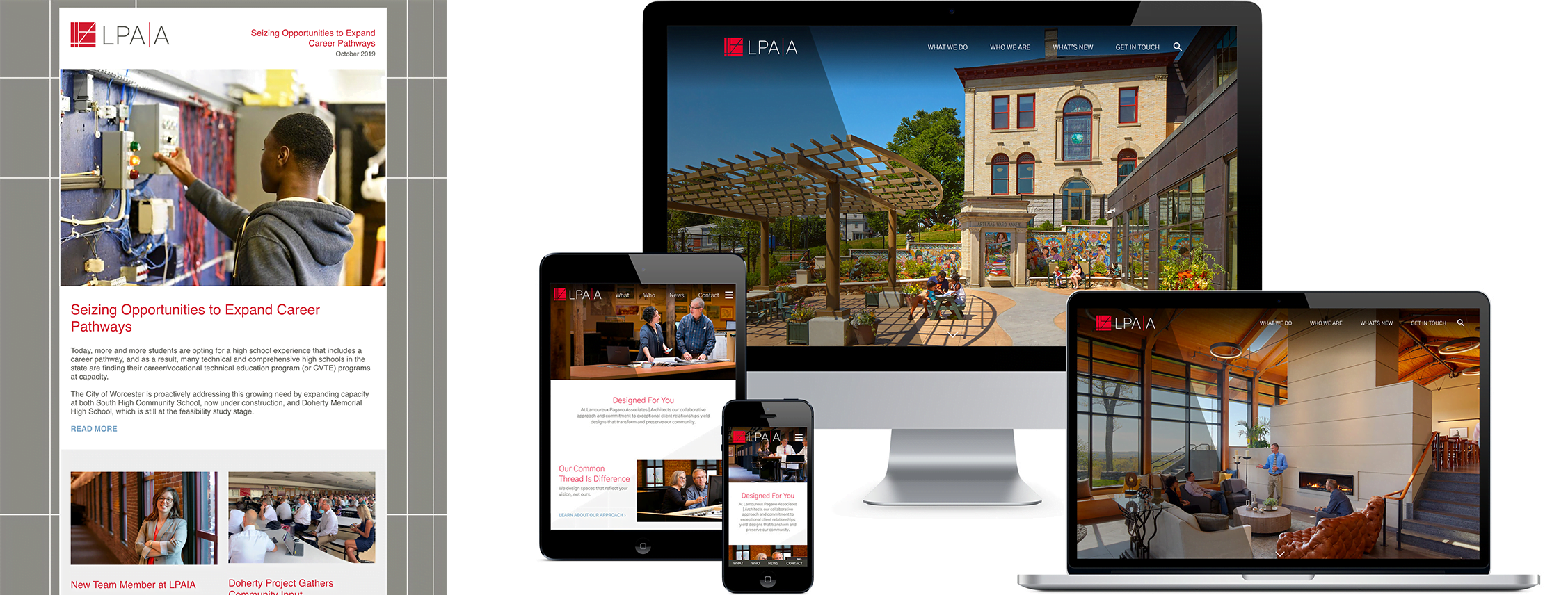
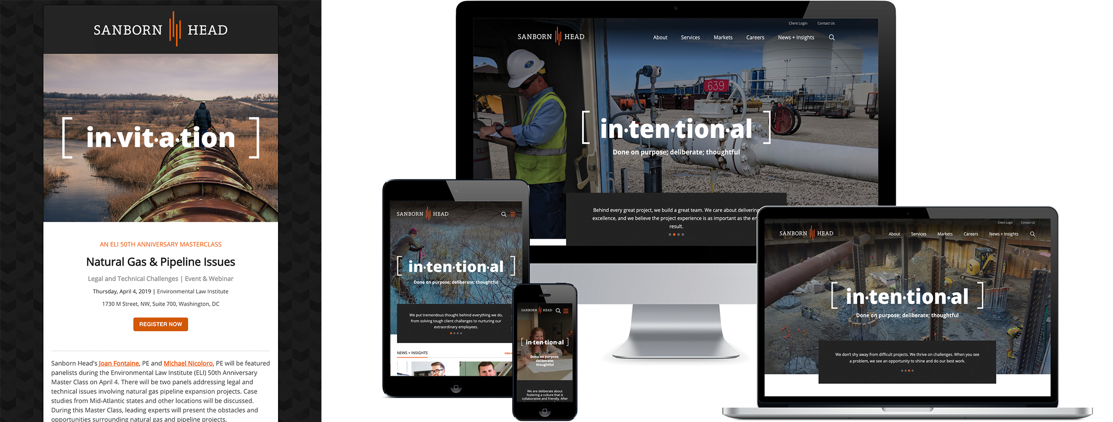
In the following examples, we’ve included a sample of the email template on the left paired with the branded web design on the right. You can see obvious similarities between the two, which helps create a cohesive brand image across channels.
Check out some examples below:
In Conclusion
We know that email marking can be hard, but with a well thought out strategy, consistent branding components, and a little bit of creativity, you can use email marketing as a successful channel to communicate with your audience. If you need help creating branded templates for your firm, feel free to reach out, we’re always ready to help! 🙂

