2020 is a great time to reflect on the past decade and look ahead to the decade to come. Change is the only constant we can be sure of. We will need to constantly adapt to new technologies and norms, as will your firm’s website, which often acts as the hub of all marketing efforts.
That said, here are my top five ways to incrementally improve your firm’s website for 2020:
- Calls to Action (CTAs)
- Impact Statements
- Hover States & On-Page Animation
- More Engaging About and Career Pages
- Long Scrolling Pages & Sticky Navigation
1. Calls to Action (CTAs)
Product websites have mastered the art of impactful calls to action, but many professional service firms still struggle with how to effectively apply calls to action to their websites.
Checklist for Adding Website CTAs:
- Identify the page(s) that warrant a CTA (such as pages with high visitation or unique or targeted content)
- Consider where the reader is in their visitor journey
- Determine the desired next action you want the visitor to take
- Craft a clear message for the call to action
- Implement the call-to-action so it will be seen at the appropriate location (top, bottom, sidebar, etc) and time (always on-page, timed delay, on scroll, on exit, etc.)
Call to Action Examples:
- Subscribe to the blog
- Optional, sticky call to action with a customizable message on each blog post
- Share post via social media or email
- About the Author block including links to the author’s bio, LinkedIn profile, and to read more posts by that author
- Read Next for other related articles
Click to view the video below or visit the page directly.
The sticky sidebar CTA is the most noticeable since it stays on the screen as you scroll down the page. Obermayer typically utilizes these CTAs to encourage site visitors to contact a specific attorney who is an expert on the blog post’s topic.
Calls to action can also appear as pop-ups with a variety of trigger options (pages visited, time on site, etc.). Pop-up and sticky CTAs have higher click-through rates because they are more noticeable, but there is a fine line between mutually beneficial and annoying CTAs. Always add CTAs to your site thoughtfully.
2. Impact Statements
If you want a prospective client to read one thing on a webpage, what should it be? Impact statements are generally large text near the top of a webpage that succinctly summarizes what the page is about in a client-facing manner.
Service Page Example:
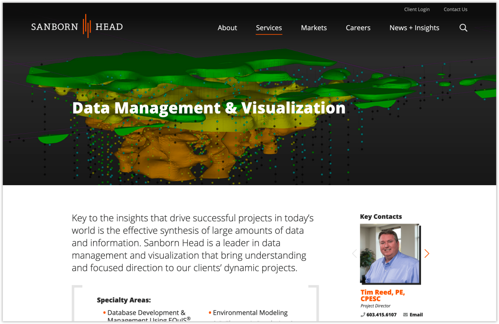
Immediately below the main page title, “Data Management & Visualization,” the impact statement is set in a large point size for easy skimming on any device.
Bio Page Example:
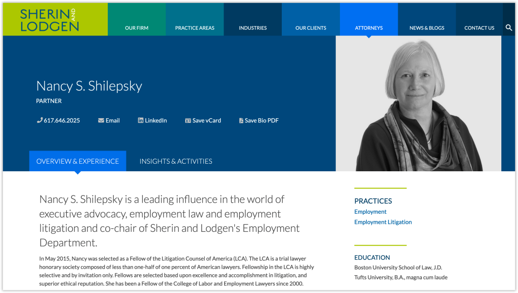
On all of the Sherin attorney bio pages, the first sentence is significantly larger than the standard body copy, for a quick synopsis of their skills.
Project Page Example:
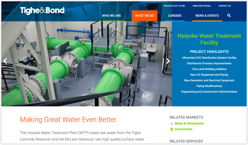
Tighe & Bond’s project pages include the project name and quick project highlights at the top of the page, but the marketing-driven impact statement, “Making Great Water Even Better,” appears at the start of the body copy.
Quote Example:
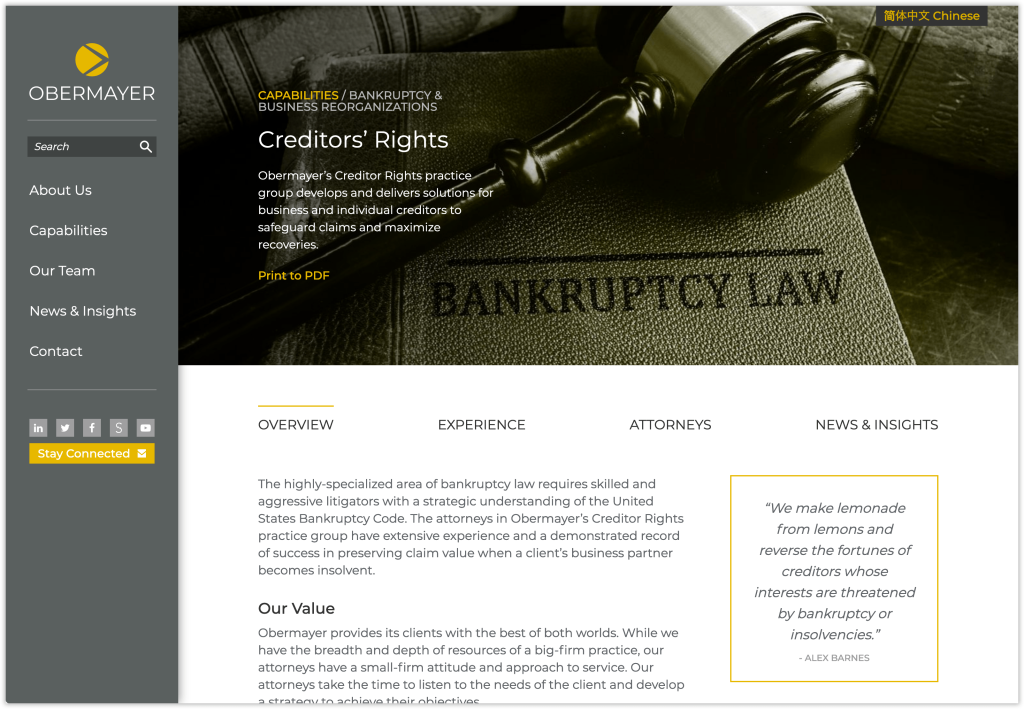
Impact statements can also take the form of personal quotes. On this capability page, a powerful testimonial is featured in the yellow box.
3. Hover States & On-Page Animation
Many advances have been made in the way sites appear as you interact with them. Often, subtle changes to text, photos, and graphics occur as you mouse-over or scroll.
Hover States
Hover states help reinforce what is and is not clickable on a webpage. Text links often change color, are underlined or marked in another fashion when you roll over them. Clickable images often zoom in or have a color overlay added or removed. See examples of hover states on LPA|A and Environmental Partners.
On-Page Animation
When you first navigate to a page or scroll down a page, you may see text and images fly in. When used judiciously it can make a site feel very modern, but too much motion can slow down sites and give some visitors feel motion-sick. See a subtle example on Juna’s team landing page when you first scroll down the page.
4. More Engaging About and Career Pages
Dry, text-only About and Career pages are out. In a competitive marketplace, firms are revamping their sites’ About and Career pages to be more engaging. The first step is to revise the text to be scannable and more interesting by adding headlines, call-outs, and quotes. The next second step is to add more visual content such as videos, photos, icons, stats, and timelines.
Scroll through Sanborn Head’s Our Firm page here:
About & Career Page Examples:
- Sanborn Head About Page and Careers Pages
- LPA|A About Pages
- Edelstein About Page and Careers Pages
- Obermayer Career Page
- Bowditch Careers Pages
Learn more about how to create an engaging about page and how to design a careers page to recruit top talent.
5. Long Scrolling Pages & Sticky Navigation
Remember when all the most important information needed to remain “above-the-fold” in web design? That is a distant memory. As we consume more content from our phones and tablets, scrolling has become a reflex-action. Long scrolling pages are not new, but they are becoming more popular again fueled by our scroll-happy habits and improvements in site navigation. Sticky sitewide navigation and sticky on-page jump navigation significantly increase the usability of long scrolling pages by making it easy to jump to other pages of the site without scrolling back to the top or to another section of the current page.
Horizontal Sticky Main Navigation Example:
Sticky On-Page Navigation Example:
The long scroll on the content-heavy product pages makes these pages more attractive and easier to process. For anyone looking for specific content on the page, the on-page navigation sticks to the top of the browser window to make it easy to jump down the page to the desired section of information. View the video below or visit the product page.
For other site improvement ideas, please see the 2019 site suggestion list including advanced site search, GDPR, web accessibility and more.
Danielle’s article also appeared in SMPS Boston’s Outlook, January.


