Congratulations to our client, Kennedy Jenks (KJ), on their new logo and website! KJ designs and engineers major water, utility, transportation, and environmental projects across the U.S.
Over their 100-year history, KJ has grown an incredibly strong client loyalty with 90% of their work now coming from repeat clients. Clockwork developed the new logo, website, brand messaging, and brand standards to support the firm’s strategic and marketing initiatives as it launches into a new century.
Logo
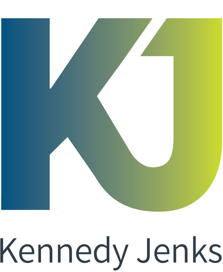
Kennedy Jenks needed a new logo that would support their branding, marketing and strategic initiatives for their centennial year. The emblem is a combination of the firm’s initials KJ, which is how most clients and employees refer to the firm. The blue-to-green gradient is symbolic of the firm’s water and environmental services. It is also meant to convey a modern, “techy” feel that subtly emphasizes the firm’s focus on innovation in engineering.
Website & Brand Messaging
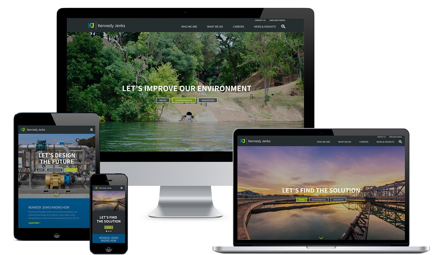
The new, responsive website establishes a completely new brand identity for the firm. The site features a handful of case studies that best demonstrate the firm’s expertise. The homepage headlines are crafted to draw in current and prospective clients and employees with collaborative and forward-thinking statements.
Visit the site at kennedyjenks.com.


