Peabody & Arnold is proud to be one of the oldest law firms in Boston, but the firm realized that their dated website and marketing materials were making the firm seem old-fashioned. We helped create a fresh new brand for the firm that aligns with their modern business approach, broadens their reach, and emphasizes and showcases their strengths as a litigation and insurance coverage powerhouse.
Website
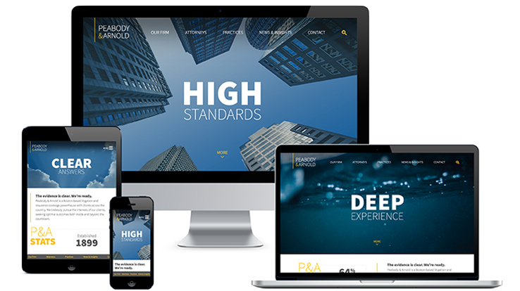
The new homepage is bold, modern, and targeted. The messaging highlights what clients value most from the firm: “High Standards. Clear Answers. Deep Experience.” The homepage also emphasizes the firm’s impressive credentials with rotating statistics paired with the headline, “The evidence is clear. We’re ready.”
Site Features:
- Responsive design
- Predictive site-wide search for people and practices
- Full-width image banners, featuring custom editorial-style photography
- Sticky footer on tablets and smartphone screen sizes
- Programmatically-generated PDFs available for bio and practice pages
- Tabbed bio pages
- Easy to manage bio badge awards
- “Meet Our Team” portrait carousel on practice pages
- Integrated blog with an attractive photo grid layout
- Crosslinking between bios, practices, and blog posts
Visit the site at peabodyarnold.com.
 Logo
Logo
The logo was completely modernized using a clean, sans-serif font, a gray and yellow palette, and a vertical rule that consistently anchors the logo to the top of the page.
 Print & Digital Collateral
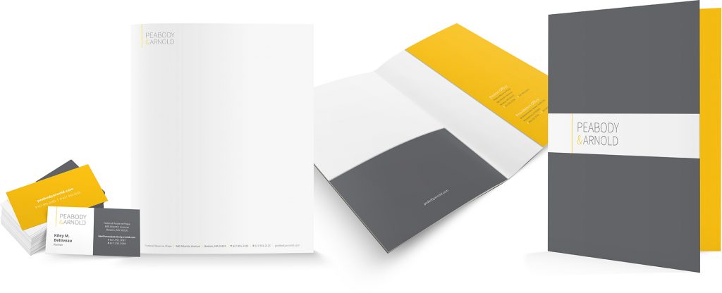
The gray and yellow color palette carries through all marketing materials including pocket folders, stationery, PowerPoint template, LinkedIn company page, email marketing template, and more.


