Thinking back to good old days of print, we all intuitively knew what to do when we got to the bottom of a page: Turn it.
But the same is not so true for web pages. Too often, we get to a “dead end” and are not really sure what we should click on next. Product websites figured out a long time ago that in order to sell online, they needed to have strong, obvious call-to-actions on every page. But many professional service firm sites still struggle with the concept. Here are a few examples of ways to avoid dead ends on your website.
Relate People
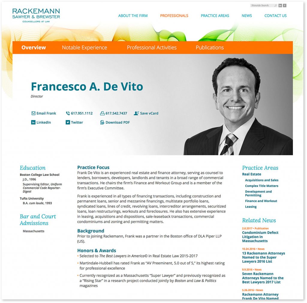
For professional service firms, your people are your greatest assets and can make or break a prospect’s decision to work with your firm. Bio pages can be some of the most heavily trafficked on your site, so make sure your bio pages are not dead-ends. Drive traffic to related practice, industry, projects, case story, news and other pages from every bio page.
And drive traffic back to bio pages from other pages of the site. In the example below, this Industry page features related experts, as well as related news and client stories.
Use News
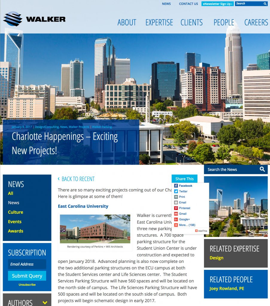
Your news section is typically the most regularly updated part of your website. Often, visitors may arrive at your site from a news story link they found via social media, Google, or an email blast. Once they read the story, keep them exploring your site by offering links to related projects, people, industries, and other news stories. And don’t forget to offer easy access for readers to SHARE your news content via social media.
Push Projects
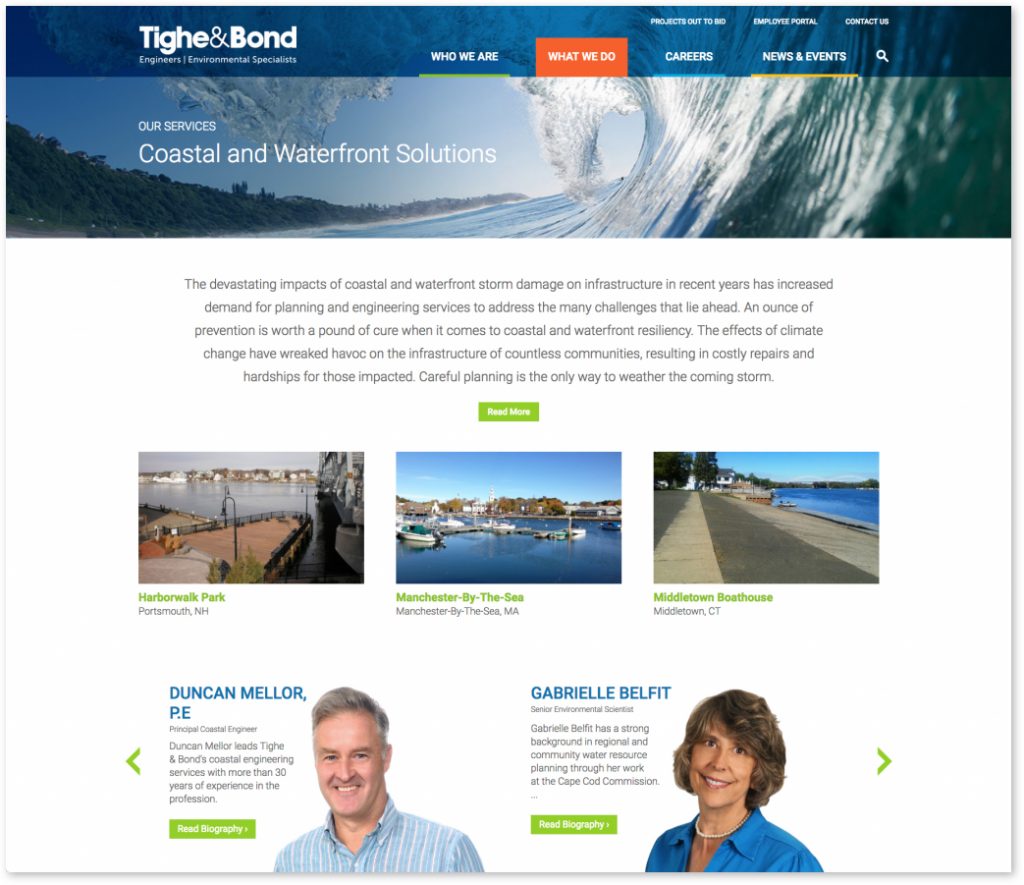
If a visitor to your site reads about a service you offer, they most likely are interested in projects related to that service. So show them! A great way to avoid dead end service pages is to entice readers to click on thumbnail photos of related projects.
Related projects can also be shown at the bottom of every project page. If a visitor clicked a waterfront project, for example, chances are they’d like to see other waterfront projects you’ve worked on.
Offer Content
If you have whitepapers, articles, or any educational material, make sure to highlight it on your website. Most users are willing to enter their name and email address to download valuable information, so use that to your advantage. Create simple forms that you can pepper throughout the site for visitors to access “gated” content.
Sign Them Up
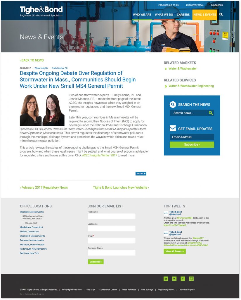
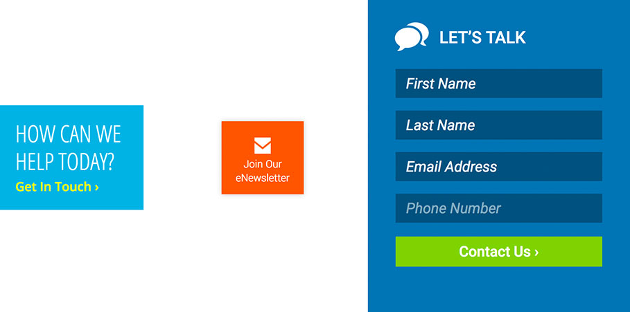
An email newsletter blasted on a regular basis is one of the most effective ways of staying top-of-mind with clients and driving traffic to your website. In order to build your list, be sure to encourage visitors to your website to sign up for your email. Consider a simple form in the footer area of every page of your site, as well as easy subscription to your blog prominently featured in the sidebar.
Captures Contacts
Your website most likely has a Contact Form page, but are you enticing people to use it? Prompt visitors to take the next step and fill it out, with friendly reminders throughout your website. Also, try adding simple forms throughout the site that ask for minimal contact info, just to get the “conversation started.”
In closing, always consider what you want a visitor to do next, on each page of your site. When adding links to pages, think in terms of two-way “cross-links.” For example, if you link from a news story to a related person’s bio page, you should also link from the bio page to that news story page. We custom-code these types of cross-links into the content management system of sites we build, so it’s easy for site administrators to establish cross-links with one click, and have the content appear on multiple pages of the site.
Vanessa’s article first appeared in SMPS Boston’s Outlook, March.

