As a designer and marketer, I’m constantly looking at websites and analyzing what’s working, what’s not, what’s new, what’s passe, and most importantly… why these changes are happening. As I look at A/E/C and other professional service firm sites, one feature is becoming more and more important – an often overlooked or very small field called “Search.”
If your website lacks a search field, or if the search returns are basic at best, read on for why you may need to invest more in your search functionality.
How We Navigate
When you think about how your website visitors find information, consider the analogy of a shopper in a brick-and-mortar store:
There are times when I walk into a shop and a salesperson asks “May I help you find something?” and my honest response is “No thanks, I’m just looking.” In these instances, I may be searching for a gift, and although I don’t know exactly what I want to buy, if something catches my eye, I’ll consider it.
Other times, I go to a specific store to purchase a specific item, like a tube of lipstick at the Clinique counter. Or, I go to ask for information that I know an expert at the store can help me with, like which of the many styles of Nike sneakers will best suit my needs.
Browsing Visitors
Website visitors follow similar styles of navigation. Some come to your website to “browse.” They may be interested in working at your firm, they may have heard your name or met someone who works there, or they may be considering you for an RFP short list. Either way, their goal is to look around and get a general idea of your people, services and capabilities. If anything along the way catches their eye, they will click to read more.
“Browsers” will typically use the main navigational tabs (such as About Us, Our Team, Contact Us, etc.) to “stroll” around your site.
Visitors With A Purpose
More often, people coming to your site know, or have a good idea, what they are looking for. It may be a specific person, or they may want information relating to a specific keyword. In short, they want a quick means to search and relevant, obvious results.
Search is the New Norm
Years back, we’d design websites with eight or nine (or more!) main navigational tabs. No longer. Now, if we give visitors five or six, that’s a lot. Less is more. Consolidate your content under just a few main tabs, with easy to use drop-down menus, and beef up your search functionality.
Here are a few examples of sites with advanced search features:
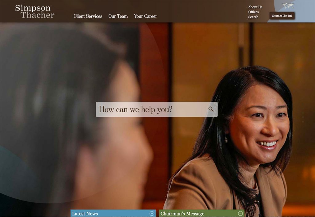
Simpson Thacher places search front and center on the homepage. When you drop your cursor in, it immediately offers suggestions to help you navigate.
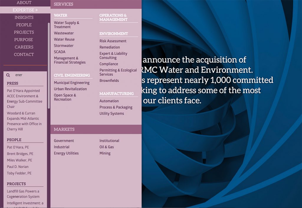
The Woodard & Curran website offers both “strollers” and searchers ways to navigate. Mousing over “Expertise,” as shown above, expands the menu to reveal a listing of Services and Markets. While keying in “ener” in the search field suggests results that are grouped by section: Press, People, Projects, etc. Note that I did not type the full word “energy,” but the search still suggested results based on the letters I filled in. Referred to as “predictive search,” this can be helpful to site visitors as it organizes results and eliminates the need for an additional search results page.
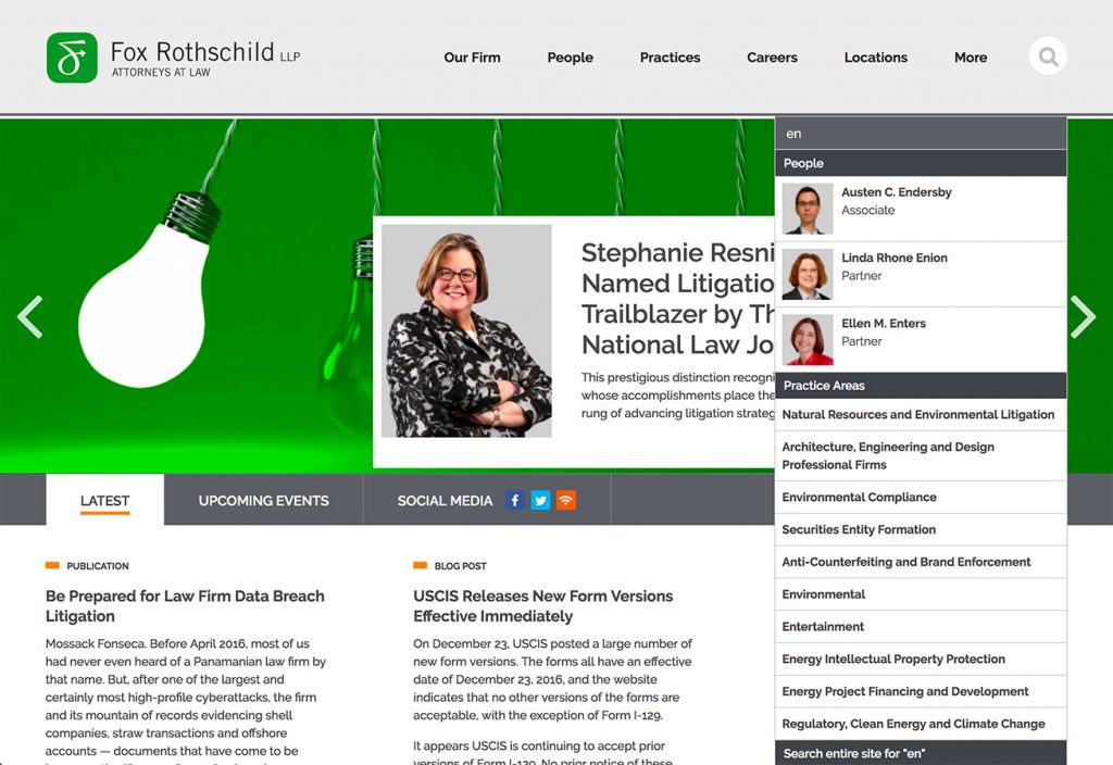
On the Fox Rothschild site, entering “en” in the search field returns People (with portraits, nice touch!) first, then Practice Areas.
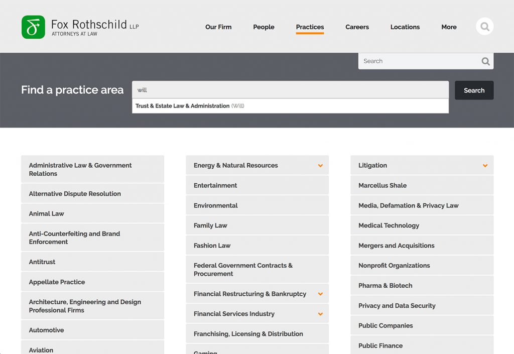
On the firm’s Practice Area page, finding a practice area among the long list of main and sub-practices is simplified via search. Not only does it suggest results for “energy” practices if you type in “en,” it also suggests “Trust & Estates” if you type in “will.” Pretty smart! But actually, a human is required to key in “nicknames” for each practice area in the CMS back-end. So don’t worry, a marketing mind is still required. 😉
Nicknames are especially useful if you have a lot of content on your site. For example, if your portfolio includes a large number of projects, letting people key-in a word and offering results, including nicknames, may be a far easier way for visitors to find what they seek. Too many A/E/C sites have laundry-lists of projects, or confusing sorting/filtering mechanisms that frustrate users.
A Google Culture
We’ve become a “Google Culture.” We expect to find what we are looking for by entering a word or two at most, and having the results handed to us, in a matter of seconds. As you evolve and improve your website, make sure you consider the importance of search and make finding content as easy as possible for your site visitors.
For more on advanced search, see this article by Great Jakes.
Vanessa’s article first appeared in SMPS Boston’s Outlook, January.


