Email is 40 times more effective at acquiring new customers than Facebook or Twitter. – McKinsey In today’s lesson, learn how to use best practices in email newsletter design to convert your lists into loyal clients.
Top 10 Best Practices for Effective Email Newsletters
1. Short and Catchy Subject Lines
There are two effective ways to write a subject line, in both shorter is better. Ideally, using less than 40 characters will gain the most impact.
- DIRECT APPROACH – The direct approach is when you get straight to the point and make it very clear what the email contains and why it’s relevant. For example, “How to Get 1K Subscribers in 7 Days” is a direct subject line.
- CURIOSITY APPROACH – The other approach is the curiosity subject line. This will entice people to open your message because they want to know what is inside. An example of this is “I can’t believe this just happened…” Some services allow your to choose multiple subject lines, afterward, you can see which got a better open rate. Try out a few and see which work best for your firm.
2. Target Your Audience
Customize your newsletter based on your target audience. Some ways you can segment your lists could be by current and former clients, clients by industry and/or practice area, referral sources, colleagues & networking contacts just to name a few. Even if you’re blasting to your entire list, make sure you’re sending out relevant information. Always try to give back to your audience by creating meaningful and useful content. Their inboxes are pretty cluttered, don’t give them an excuse to unsubscribe. In fact, segmented email campaigns perform 14.37% higher than non-segmented campaigns.
3. Keep It Branded
If you’re sending an industry or practice group specific newsletter make sure the header graphic and imagery throughout relates clearly to what you’re talking about. It always a nice touch to have your imagery follow a similar style throughout the newsletter. Always keep it consistent with existing brand elements and styles for maximum impact. Setting all your post graphic headers to the same width and height can make your newsletter feel more organized and easy to read.
RESOURCE: Where to Find Great Stock Photos
4. Personalized Touch
Personalizing the message content can boost open rates significantly. Something as simple as using their first name in the body of the newsletter or changing out imagery to be more focused on what industry they belong to goes a long way. Make sure your email lists are in good shape and are organized properly to avoid the pitfall of using the wrong information. ? Take a look at the way that Emma handles this in the video link below.
RESOURCE: Dynamic Content Powered By Emma
5. Do Some Housekeeping
If your CRM (Customer Relationship Management Tool) can connect with your eMarketing service then your contacts can always be up to date, otherwise, you’ll have to manually go in and handle your email lists. Don’t panic if you see that emails are bouncing once you send your eNewsletter, bounces will happen. This happens when someone’s email address has changed, their inbox is full, or something is marking your email as spam. Check the settings on your email marketing platform for specifics on this.
6. Don’t Be Afraid of Whitespace
Sometimes we may feel like we need to cram everything and the kitchen sink into the newsletter. Along with keeping each post brief don’t be afraid to leave open whitespace around each post. People inherently know to scroll through emails, so it’s important to let each post breathe. This will help your visitors to easily digest each piece of content.
7. Calls-to-Action
Remember your goal, you want people to click through to your website so you can track what kind of information is the most relevant to your clients. Because of this, we recommend that you don’t put the entire article in your email. Rather, include short introductions for each post, followed by a clear call to action button that will direct people to your website. Extra points if you use clever and insightful names for the buttons. This will help with the step 10.
8. Mobile / Responsive
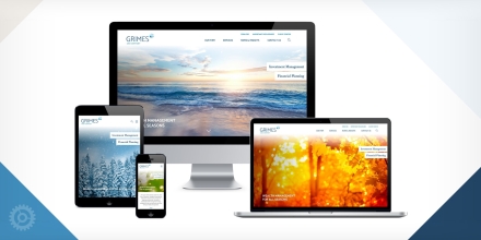
More than half of emails are now opened on mobile devices. Be sure to preview your email before you send it out to make sure everything looks right on your phone and tablet. Just about every email marketing platform today supports mobile-friendly responsive designs, make sure your template is responsive ready.
9. Friendly Footer
Your footer is a great place to showcase your social media accounts and contact information. Many email marketing services allow you to build this information right into the template. This helps to make it consistent on all emails you send.
10. Test Before You Send / Check Your Stats After You Send
A/B Content Testing takes the guesswork out of your marketing and gives your subscribers a vote in how you market to them. Different email marketing platforms will allow you to test variables from 2 emails across a percentage of your audience. Some of these differences may be CTAs (call-to-actions), image placement, content length, subject lines, preheader text, and sender name and address just to name a few.
After the email has been sent to your lists check back within the next 24-48 hours to see which posts did well. Think of more content for the following newsletter that could be relevant to these new insights.
A Few Examples
RELATED POSTS:
Email Marketing Performance Benchmarks for Professional Service Firms


