
Full-screen video backgrounds (large videos that auto-play when you first come to a website’s homepage) have been around for several years, but are becoming more and more popular on professional service websites. Are they something you should employ, or a fad that will be gone in a few months’ time?
Let’s begin by looking at a few examples of sites with video backgrounds (click each screen below, use a desktop or laptop computer to view):
Gecic Law
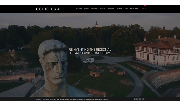
Gecic Law is a small, regionally focused European law firm. The video shows a scenic “drone’s-eye view” of the cities where the attorneys presumably target their work. The sweeping panoramic videos portray a sophisticated and innovative style, in keeping with the firm’s mission.
Powerhouse Company
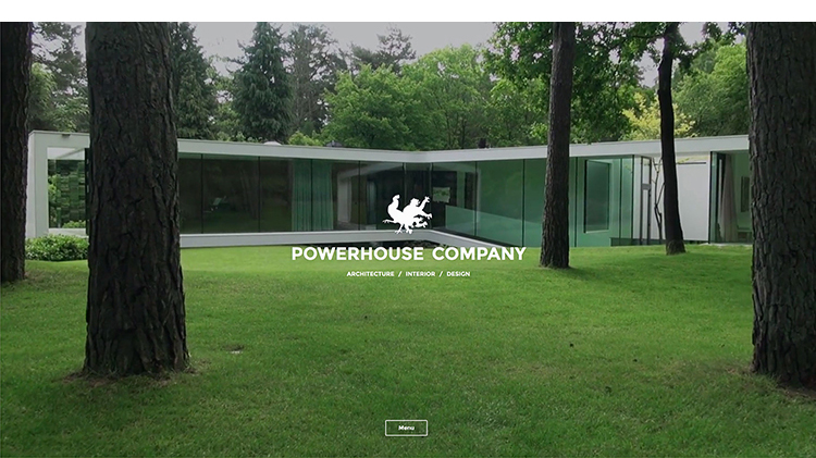
This Scandinavian architectural and design firm features video that slowly glides us into and around finished structures, exteriors and interiors, and over the yachts they helped create. The effect is calming, peaceful, and understated.
Businesspark
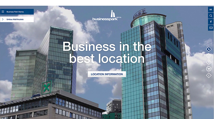
Businesspark is an office complex in Vienna. The videos are subtle: Clouds slowly move behind tall glass buildings. As you scroll down the page… hands type on a laptop, steam rises from a bowl of cooked veggies, people walk past a café counter… We get a real feeling for what it’s like to work within the office park.
Herrick
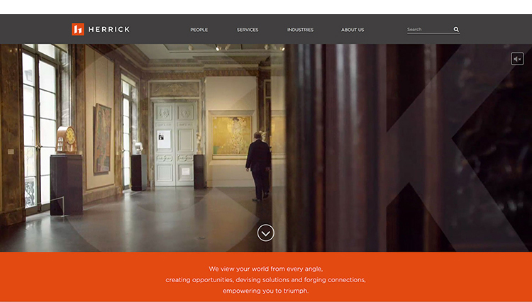
The Herrick law firm site uses slow-motion scenes of attorneys in their offices, with clients, in the field, reinforcing the message “We view your world from every angle…” The name of the firm moves across the screen in a ghosted white overlay. The cinematography is of the highest quality. People look candid and natural. The music plays automatically, which can be distracting especially when the site is viewed in a quiet office environment.
SWT Design

For this architecture firm in Saint Louis, MO, the homepage opens with the statement “Design is a living, breathing thing”. The multiple video backgrounds feature nature images as well as buildings and people, and change on refresh (if you reload the homepage, you’ll likely see a different video). Some of the videos use a split-screen with a person standing on one side, and a message on the other. Although the concept of pairing a person and message is in keeping with the overarching theme, the people look self-conscious and uncomfortable (a common problem when filming non-actors). Throughout the website there are other subtle uses of video. Notice how the main menu options “play” on mouse-over.
KSS Architects
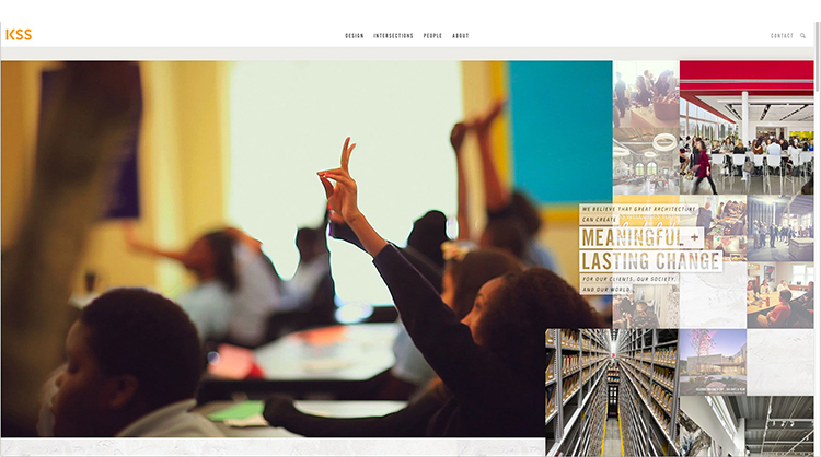
KSS Architects of Princeton, NJ has a lengthy video behind a complex sidebar mosaic. Lots happens as you scroll down the page and mouse-over photos. The overall presentation is eye-catching, although somewhat overwhelming. As we move about the site, there are too many textures and design elements in addition to the video. It’s hard to know what to look at or click on first.
There are many factors to consider before adding video to your homepage. Here is a brief list of pros and cons:
Pros:
- Video is engaging. We are naturally drawn to moving images. They pull us into the website and, hopefully, encourage us to explore more.
- Videos can help convey your brand. In a split second, a video can set a mood or evoke a feeling, which is harder to do with a static image or via text.
- Videos look modern. Website trends are always changing, so it’s impossible to know if video backgrounds will start to look dated in a few years. But for now they seem cutting-edge. Video sends a message to site visitors that your firm is forward-thinking.
Cons:
- If your homepage doesn’t load quickly, visitors may get frustrated and go elsewhere. A well programmed website should load a video quickly and not make visitors wait while a “loading” wheel churns. However, if a user has a slow connection, they may find your video homepage slower to load.
- Video backgrounds are inherently auto-playing — they play without the user clicking anything. But many mobile platforms (including iOS) and legacy browsers do not support auto-playing video. Thus, a backup option is required, such as a static image.
- Videos can be distracting. It’s important to think of these as backgrounds, not documentaries. Lengthy or highly detailed videos will compound load speed issues.
General Advice:
- It’s important to think of these videos as backgrounds, not stories. Don’t try to explain what you do, simply set the stage.
- Limit the length of background videos to 15 or 20 seconds at most, then loop the video to start over.
- Hire a professional videographer and editor. Videos that look “home-spun” can have a negative affect on your brand.
- Do not have sound auto-play. If you really want music or ambient noise (which I don’t recommend), allow users to turn it on themselves.
- Don’t over complicate. If you add video to your website, keep the rest simple. Video can be distracting, so confusing users further with non-intuitive navigation and other design elements can be overwhelming.
In closing, if you decide to use a video background on your website, be sure to stay on-brand. A video background is the perfect opportunity to convey the personality of your firm. Start by defining your brand, and then create a video background that reinforces it.
Vanessa’s article first appeared in SMPS Boston’s Outlook, .


