A quartet of new law firm projects, that is! No singing attorneys will be found on this blog post.
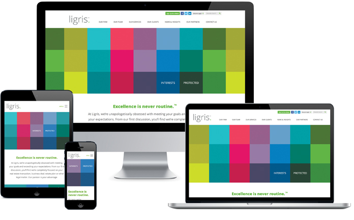
Ligris & Associates
A complete overhaul of the firm’s brand began with the redesign of the website and logo. The new site features bright colors and bold messaging. Design elements showcase the personality of the firm and attorneys, including individual photo galleries – inspired by social media – at the bottom of attorney bio pages. The full brand rollout included colorful new stationery, pocket folder, mini-brochure, and email marketing templates.
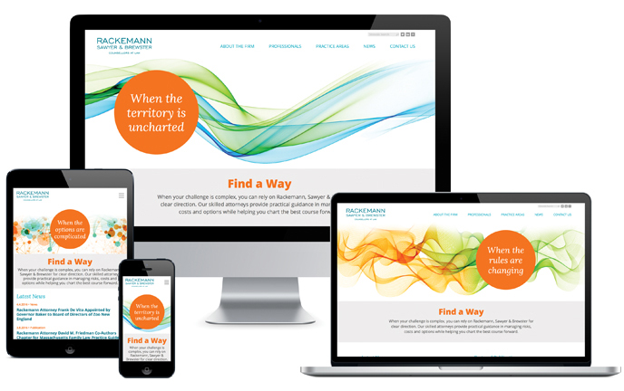
Rackemann, Sawyer & Brewster
After an initial brand analysis phase, Clockwork crafted homepage messaging that realigns Rackemann’s brand promise with their clients’ brand perceptions. The new positioning emphasizes the firm’s ability to “Find a Way,” providing practical guidance for complex problems. The combination of bright, abstract graphics and black and white portraits makes the new website feel modern as well as sophisticated.
Fleischman Law Firm
The elegant firm overview brochure serves as a top-level introduction of Fleischman’s capabilities and services. The stunning NYC cityscape photos used on the firm’s website translate well to this print brochure and ensure consistent branding. We designed the brochure with a pocket on the inside-back cover to house attorney bios or other insert sheets. Website text was edited and streamlined to engage potential clients.
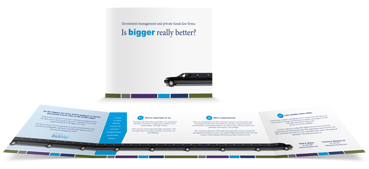
Rich May
Rich May’s boutique Investment Management Group needed to make investment advisors aware of the services the attorneys provide. Rather than sending a formal business letter, we created an accordion-fold mailer that grabs attention with a benefit-centric concept, “Is bigger really better?” As the mailer unfolds, the stretch limo gets longer and longer… humorously reflecting fees charged by bigger firms.
If you are interested in seeing some of our other law firm projects, please visit our portfolio.


