Subtle changes to design can make a huge difference in a website’s overall mood and feeling. To illustrate this principle, we’re showing 3 variations of a homepage design. For all the examples, we’ve maintained the same layout and site structure, but modified the font, color and photography choices. You may be surprised how different they look!
Mood 1: Light, Airy & Calm
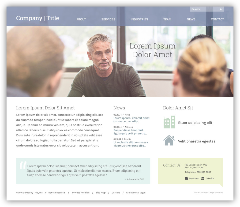
The first design uses a slab serif thin font with a muted, pastel color palette. In this case we’ve selected a photo that is evenly lighted with a soft focus. The blocks of color below are subtle and very lightly colored to differentiate them from the main body copy and news links. The mood here is calm, subdued and quiet. The design doesn’t hit you over the head, but instead lets the typography tell the story.
Mood 2: Modern, Happy & Bold
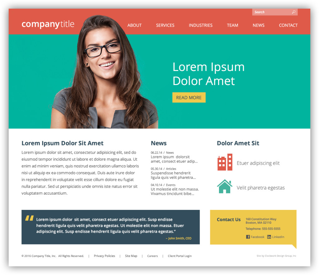
As you can see, we’ve maintained the same layout and site structure as example one, but this design has a very different feel to it. A sans-serif font with various weights, paired with a bright color palette, makes this design feel more energetic. In this case we’ve used casual portrait-style photography with a vibrant colored background. The mood here is lively, bold and happy. This design is memorable and modern; it isn’t easily forgettable.
Mood 3: Classic, Traditional & Corporate
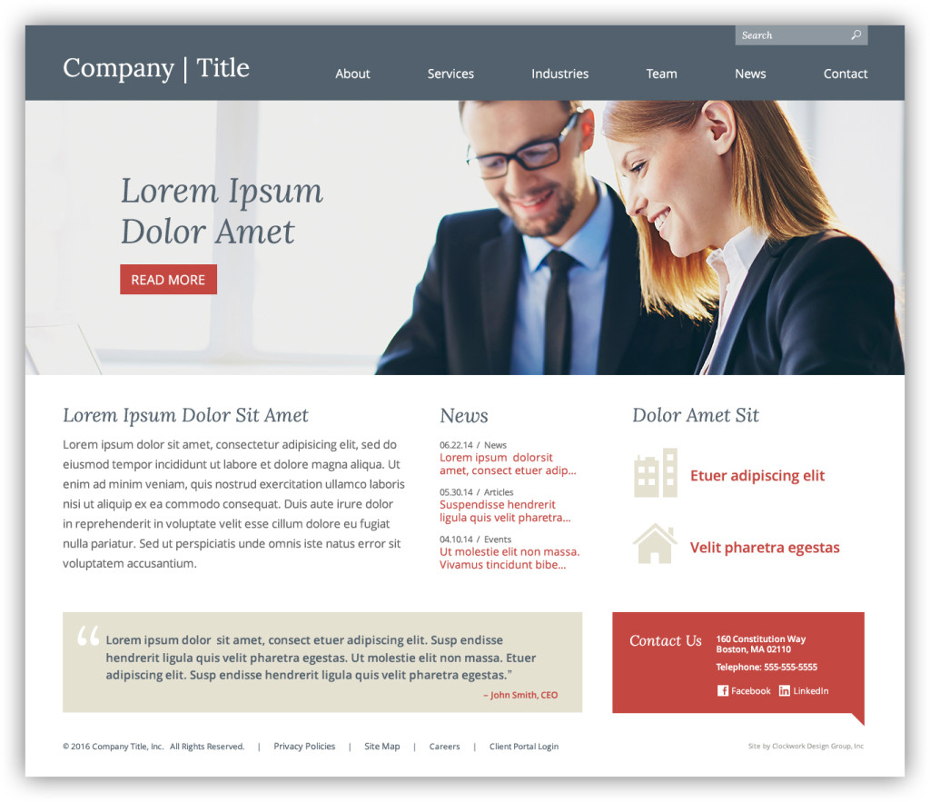
This design uses a serif font with a traditional gray, tan and red color palette. The photography is taken in an “editorial” style, where people are interacting and appear real and natural, rather than posed. Here the mood is corporate and professional. But the somewhat generic and more common colors, fonts and photography may seem less memorable overall.
In Conclusion
As you can see, the layout and grid is only a small part of any design. Color, typography and photography have a huge impact on how the design “feels”. It’s important to understand how you want to present yourself to the audience you’re trying to reach, and design accordingly.

