Every year, web design grows and evolves. Here’s a quick run-down of some web design trends that made an impact throughout 2015, and will continue to change how we design for professional service firms. Read on to see how you can implement these techniques in 2016:
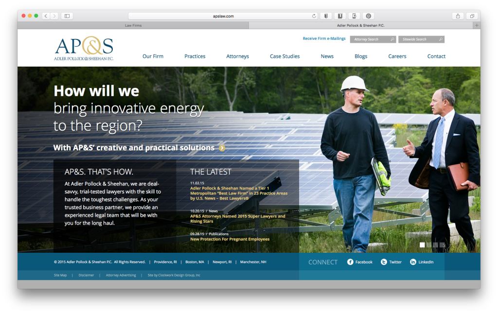
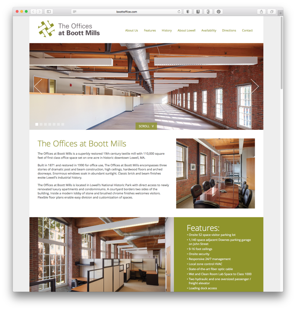
1. Large, Beautiful, Realistic Photography
Vision, our sense of sight, is the strongest human sense. Using beautiful, realistic and engaging photography is one of the fastest ways to make an impression on website visitors. Now that technology has been updated, using large and well-crafted photos has become a real game-changer. Stock photography is still a major way to communicate in the digital world, but the quality of the photos has come a long way in just the last year. With community driven photography sites like Unsplash, Picjumbo, Stocksy and Death to the Stock Photo, designs have taken on a more realistic aesthetic for both web designs, brands and social media posts. The result is more engaging and genuine corporate identities. Continue using real photos to connect with your audience in an authentic way.
Users pay close attention to photos and other images that contain relevant information but ignore fluffy pictures used to ‘jazz up’ web pages.
– Nielsen Norman Group
HOW TO DO IT:
If possible, use professional quality photos of real people that you work with. Try to set up a custom photo shoot with some of your key clients to visually explain who you are and what your business stands for. Think about using Case Studies to illustrate how your company has made an impact. If you’re using stock photography, try to make sure it conveys your brand pillars and doesn’t look cheesy or fake. Avoid at all costs those awkward and phony looking stock photos with super happy people wearing perfect smiles and suits.
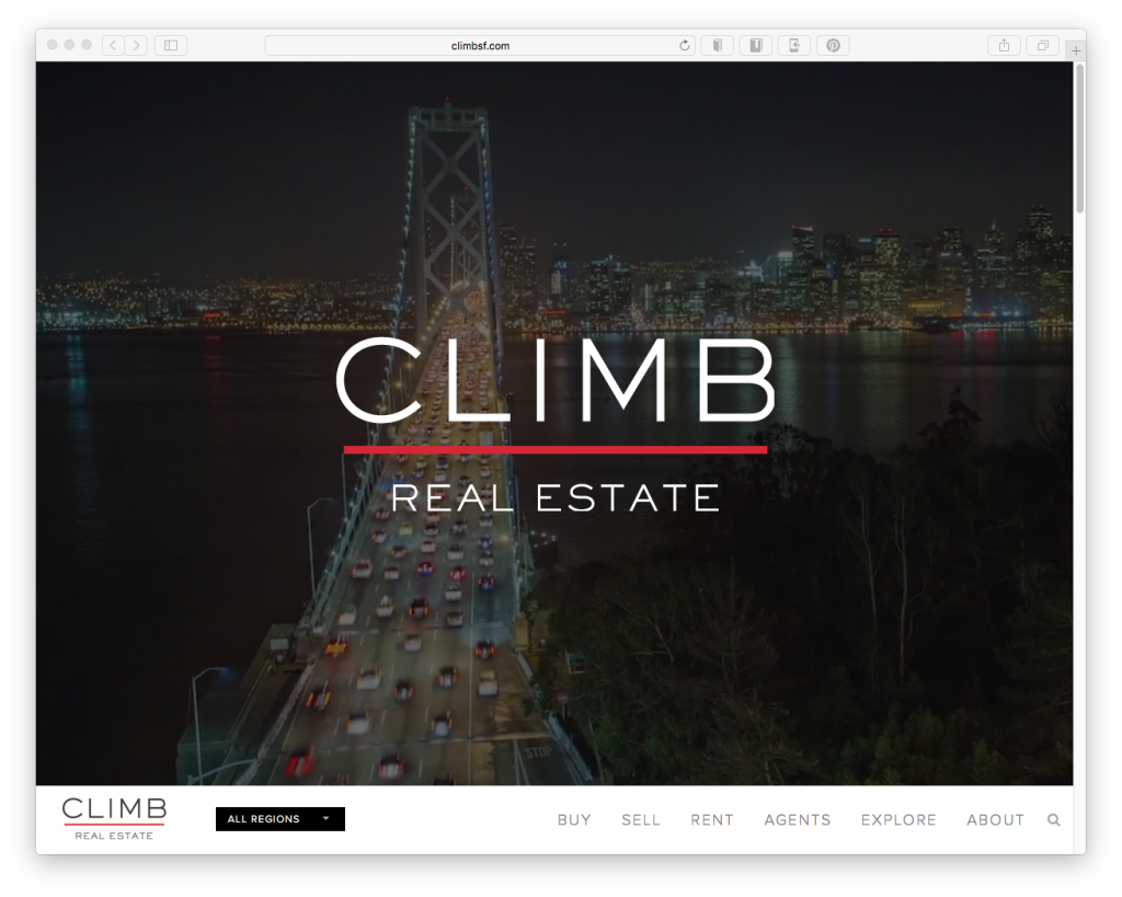
2. Video & Animated Backgrounds
Websites today can be more than just a door to your business, they can be a medium in which you can tell the story of who you are, what you believe in, and more importantly what value you can bring to potential and existing clients. The way you tell that story can be more effective when motion is involved. Online content video views have topped over 50 billion each month since the beginning of 2015. The data seems pretty clear: people like watching videos.
Users prefer content in a visual format, which explains why online content video views have finally topped 50 billion views each month.
KEY TAKE-AWAY:
Think about using a video montage on your homepage. It can be as simple as a client interacting with an employee, your office space, a project site, etc. Whatever you decide to include, make sure that it aligns with your brand. Be careful not to overuse this technique, it can be distracting to visitors if too much is moving at once. As with stock photography, stock video should be used with caution. If you’re trying explain something complex, think about doing an infographic or animation to break down some of the harder concepts. Pinterest does a great job of this in their introduction landing page and video here.
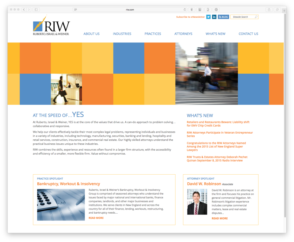
3. Grid Based Web Design
Responsive web design has become incredibly popular in recent years. People are now using their mobile devices more than ever before. It’s safe to say responsive design isn’t going anywhere anytime soon. Because of this trend, grid based designs (a.k.a. the card/tiles approach), have become more prominent. It’s a great way to divide up content into simple chunks. This type of design is responsive-friendly since the tiles stack nicely on all different screens and can create a flexible layout that looks clean and organized on any screen size.
Modular design, or ‘modularity in design’, is a design approach that subdivides a system into smaller parts called modules or skids, that can be independently created and then used in different systems. A modular system can be characterized by functional partitioning into discrete scalable, reusable modules, rigorous use of well-defined modular interfaces, and making use of industry standards for interfaces.
HOW TO GET STARTED:
Make a list of the top 10 most important pages on your website, order these pages from most important to least important. These are the pages that you want to drive traffic to the most. Find photos, graphics or icons that illustrate what the content is about. You’ll most likely need to work with a professional to design and code out the final layout, but getting your content in a proper hierarchy is a great first step.
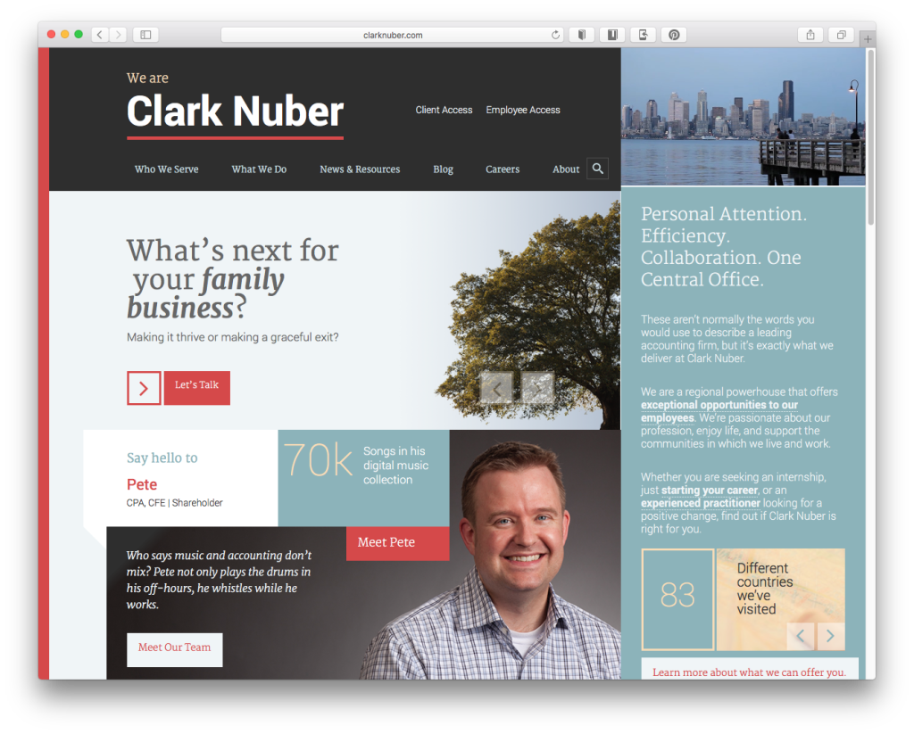
4. Material/Flat design Web Designs
Flat design is a type of interface design without any stylistic elements that give the illusion of three dimensions (such as excessive use of drop shadows, gradients or textures) and is focused on a minimalist use of simple elements, typography and flat colors. The focus of flat design is primarily on the content. It’s vital to pick the right colors to help users navigate and understand your brand. Colors can be vibrant or subdued, but are generally used in large fields. White space is also used throughout the design. Typography is extremely important in flat design, since there are few graphic elements to detract from the messaging, so your content is king. Recently, Google launched its new style language, Material Design. Material design is similar to flat design but uses some shadow effects and depth to create design that appears more real to the user. The goal of Material Design is to create a clean, modernistic design that focuses on UX (user experience). Both Material and Flat Design have a central focus on content and typography.
68% [of web designers] think that flat web design will still be around five years from now.
I don’t see flat design going anywhere for at least a decade, but what you will start to see is people referring to it less; in the same way that responsive design hasn’t gone away, we simply call it design.
-Benjie Moss, Webdesigner Depot (web design blog)
A WORD OF CAUTION:
If you like the aesthetic of flat and material design, make sure you stay true to brand, both visually and with your messaging. Since content is front and center, it might be worth hiring a professional copywriter to help differentiate your brand message from others.
5. Scrolling Web Designs
Long gone are the days of cramming everything important above the fold of your website. Scrolling is winning over clicking because the nature of web browsing pattern has evolved over time. The primary reason for this is the prevalence of mobile devices, as mentioned earlier. Smaller screen sizes and the nature of touch screens has made it easier than ever to interact with content by scrolling. Clicking links and waiting for a page to load is just too cumbersome for most web users, especially when on the go. One thing I love about scrolling designs is that it facilitates a step by step hierarchy, which makes the content that much easier to understand.
Chartbeat, a data analytics provider, analysed data from 2 billion visits and found that “66% of attention on a normal media page is spent below the fold.”
– What You Think You Know About the Web Is Wrong
FOR PROFESSIONAL SERVICE FIRMS:
A single page website isn’t always possible for professional service firms, but creating a longer scrolling homepage can be a good way to introduce visitors to your core brand values and culture. It’s a great opportunity for people to get to know who you are at a glance. Think of the page as a summary and overview of what sets you apart from your competition. From the homepage, visitors can dive deeper into your interior page content to find out more specifics on areas that might be interesting to them. Take a look at this article if you think you need more research to convince your team: UX Myths: People Don’t Scroll
What do you think is the next big thing in web design for 2016?
Send us your predictions and we’ll post the best ones to our blog!


