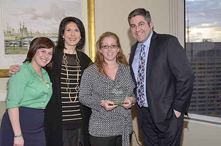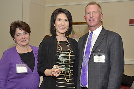
The Legal Marketing Association of New England held their 2013 Your Honor Awards last week and Clockwork Design Group was happy to share our achievements with our clients and friends! This year, Clockwork won four Awards including two for Holiday E-Card and two for Websites under $50k.
Our Holiday E-Card for Fish & Richardson won First Place honors. The firm’s mascot, “SuperFish”, has represented Fish & Richardson in holiday cards since 2008, spreading holiday cheer to clients, contacts, and colleagues. Because the holiday season is a busy time for all, this year we created a fun yet professional animation that carries the brand’s image forward. Watch SuperFish as he swims his way through a Holiday “To-Do” list of heartfelt themes that celebrate past firm achievements.
SuperFish reminds everyone what is important: home, family and friends, to sing, laugh, and celebrate. Strategic initiatives resonate throughout the card’s message, subtly showcasing Fish’s rich history as a world-class IP firm. Moreover, Fish’s services and commitment to clients helped make many of these wonderful holiday traditions possible.
Goulston & Storrs was one of the first law firms, more than a dozen years ago, to include the children of the firm in their holiday greeting. The e-card uses actual children’s drawings for a funny, playful animation.
This year, G&S moved to a Thanksgiving-timed electronic holiday card, adding further differentiation from other firms’ greetings that are often distributed in rapid succession in December. The audience for the G&S holiday card is intentionally broad, including clients, service providers, industry and bar associations, referral sources, and other contacts of the firm.
The combination of the messaging and delivery enabled the firm to achieve all of its goals for the project. The electronic cards were heavily used by lawyers and professionals across the firm, and the holiday message was extended to hundreds of the firm’s followers via social media. Perhaps the most compelling results were the anecdotes shared by recipients, including one client who responded, “As an aside, I sent this to my wife, who got a kick out of it, and sent it along to her co-workers and friends.”
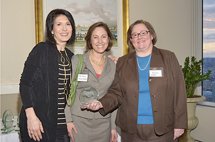
Vanessa and Deb Scaringi with Holly Polglase from Hermes, Netburn, O’Connor & Spearing
Honorable Mention – Websites Under $50K
In the websites under $50k category, Hermes Netburn O’Connor and Spearing wanted a fresh platform to continue competing with other firms serving the same industries. The firm’s marketing vision is sweeping and includes a well communicated brand and logo, an updated website, coordinating collateral materials and a push towards business development efforts to cross-sell the firm’s services.
After many talks with the Hermes Netburn team and discussing what their current and potential clients want, the theme of “keeping clients safe”evolved. Time and again, clients maintain that trust and feeling secure is a key element in their hiring decisions. The project included a new logo, site design, CMS (Content Management System), retouched attorney photographs, stock images, and thorough project management. Upon the launch of the website, the analytics data proved successful. Every month has seen a continual increase in traffic, longer time on site per visit, and a very low bounce rate.
Rich May has been a longtime law firm of Downtown Boston and has built their reputation on great experience and good business practice. However, their marketing materials were becoming outdated. With the formation of a new marketing committee and addition of a full time Marketing Director, the rebranding campaign was launched. The overall objective of the website project was to improve the public image of the firm and turn web presence from a potential negative to a definite positive for prospective clients.
In the end the goal was simple – the website should be appealing and make prospects of the law firm more likely to engage. It should energize them and make them want to learn more about Rich May. We used a clean, palette with lots of whitespace and a modern slider on the home page to feature photographs of their main practice areas and success stories. Judging by feedback from clients and friends, so far the effort has been incredibly successful. Web analytics have shown large increases in traffic that can directly correlate to the launch of the site. In a way, the new website has signaled the rebirth of Rich May.
The new websites have helped both law firms improve their online presence and overall success of their firms. We had a ball at the LMA New England Your Honor Awards and look forward to attending again next year!

